|
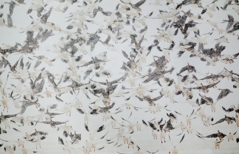
This image of both light and dark (White-fronted) geese blasting off was created at Klamath NWR, OR with the Canon 800mm f/5.6L IS and the EOS-1D Mark IV. ISO 400. Evaluative metering +2 1/3 stops: 1/640 sec. at f/6.3 in Tv Mode. |
For Your Critique: Image #1
Over the course of the next three months or so, I will present nineteen more images in this series. Feel free to praise them or tear them to shreds. As we preach on BPN (BirdPhotographers.Net), honest but gentle. Heck, no need to be gentle; polite will do. Above is “Salt and Pepper Snow Storm.” I look forward to each of you taking your best shot. Would you delete this image?
For a greater appreciation of the image above, click on the photo to view a 1400 pixel wide version. Click on the enlarged version to close it.
Shopper’s Guide
Below is a list of the gear mentioned that I used to create the image above. Thanks a stack to all who have used the Shopper’s Guide links to purchase their gear as a thank you for all the free information that we bring you on the Blog and in the Bulletins. Before you purchase anything be sure to check out the advice in our Shopper’s Guide.
Why waste time comparison shopping when you know that B&H will always offer the lowest prices? Support both the Bulletins and the Blog by making all your B & H purchases here.
Canon 800mm f/5.L IS lens. Right now this is my all time favorite super-telephoto lens.
Canon EOS-1D Mark IV professional digital camera body. My two Mark IVs are my workhorse digital camera bodies.
And from the BAA On-line Store:
Gitzo GT3530LS Tripod. This one will last you a lifetime.
Mongoose M3.6 Tripod Head. Right now this is the best tripod head around for use with lenses that weigh less than 9 pounds. For heavier lenses, check out the Wimberley V2 head.
CR-80 Replacement Foot for Canon 800. When using the 800 on a Mongoose as I do, replacing the lens foot with this accessory lets the lens sit like a dog whether pointed up or down and prevents wind-blown spinning of your lens on breezy days by centering the lens directly over the tripod.
Double Bubble Level. You will find one in my camera’s hot shoe whenever I am not using flash.
The Lens Align Mark II. I use the Lens Align Mark II pretty much religiously to micro-adjust all of my gear an average of once a month and always before a major trip. Enjoy our free comprehensive tutorial here.
Delkin 32gb e-Film Pro Compact Flash Card. These high capacity cards are fast and dependable. Clicking on the link below will bring you to the Delkin web site. There is lots of great stuff there. If you see a product that we do not carry let us know via e-mail; we will be glad to have it drop-shipped to you and save you a few bucks in the process.
I pack my 800 and tons of other gear in my ThinkTank Airport SecurityTM V2.0 rolling bag for all of my air travel and recommend the slightly smaller Airport InternationalTM V2.0 for most folks. These high capacity bags are well constructed and protect my gear when I have to gate check it on short-hops and puddle jumpers. Each will protect your gear just as well. By clicking on either link or the logo below, you will receive a free gift with each order over $50.


Well, there certainly seems to be a wide range of opinions on this one…. artie
I was reminded as a judge in my photography club, I have to make a quick decision and would probably give it a low score. Like many others, after a second or third look, I appreciate it more. It would make an excellent large print, great notepaper, etc. A quite different photo! I would certainly play with the contrast before doing anything with it.
If you have ever tried to make note paper from scratch, I haven’t tried it for years, but watching people who make different types of note paper to sell as a specialty item, the photo you have taken is very similar to end results of some writing paper creations.
A very unique photo – I wouldn’t hang it on my wall or would I – very intriquing – something you look at once, then want to go back and look again. You didn’t follow the rules of thirds, there is no path to follow as in a winding river, building patterns, (In fact you didn’t follow any compositional pattern) but a person wants to keep going back to the photos to see if they have missed anything – the photo keeps drawing you back to it, to want to explore more –
Quite an accomplishment and very intriguing. Well done ! Again !
I tried to shoot some loons in BC and the loons are 3 weeks behind with all the cold and wet weather we have been getting.
One loon has a nest with eggs and has been trying to hatch them for the past 2 weeks they said.
I went on the road from June 8th for about 2 weeks and all it did was rain everyday travelling in Alberta, Montana and BC.
Here is a very general question. When shooting song birds, is there one type of pose that is more desirable than others if you were set up in a blind and had all kinds of time to choose the best pose?
talk to you later,
Clear Ken
I like a nice side portrait showing the whole bird.
Hi Art: You indicated that you had your Mark 1V in for repairs, what type of repairs did it need.
I am thinking of switching back to Canon or at least have 2 systems again,
talk to you later,
Ken
The LCD was dead. artie
I love this image, I really like the chaos ant the “snow storm mood”
Well donne 🙂
[…] that has caught my eye. I really liked Arthur Morris’ recently posted image that he named “Salt and Pepper Snow Storm.” The title really fit perfectly with the image and it made me take a closer look. I liked the […]
You are all invited to see my comments on your comments here. Thanks all for sharing your thoughts.
I like this image VERY much. It is abstract, painterly and dynamic. It really gives the feeling of what a blast off is like, which is pretty chaotic. The movement is wonderful and the combination of light birds vs dark birds adds to the design. Definitly a keeper in my book.
This photograph actual makes a great deal of sense if you “read” it from bottom to top. At the bottom are the geese just starting rise up(hence the feet everyone notices), then they become more airborne as your eye goes to the top.
I am a great fan of this style of photography and the abstractions it produces. It would be a keeper in my library:)
Interesting to see the different views of this photo! I guess beauty lies in the eyes of the beholder. From the artist side of me, I see a workable abstract, on a very large textured canvas being very provacative! I like subtle. Not everything has to be glowing, oversaturated and perfect. Breaking the rules is pure bravery, with excellent results! It means you have a brain that can think and create. Photography becomes pretty boring if you go by all the rules.
I agree with those who think this needs to be printed large. There is a balance in this image between chaos and order that’s very visually intriguing, and that makes the image work on multiple levels. Interesting chaos such as this is hard to come by. I’d like to offer a personal story to those who see nothing but chaos. Several years ago, my wife and I had a painter friend. I did not “get” her work at all, but felt that it would be impolite to say so. To me it looked chaotic and random. Then at an exhibition opening, all of a sudden I saw what she was doing in her work. It was very far from random. The paintings were meaningful, powerful, and made with a very high degree of skill and order, though the order had taken me years to see. Since then, I’ve been very cautious about dismissing work that I don’t “get”. There might be nothing there, but just possibly the issue may be with me.
At first it looks like the linoleum in a soda shoppe. But then as I look more closely I can see so much in it. Such as the feet of the geese. The feet make this image for me. I don’t always like abstracts but I consider this a phenomenal shot because it challenges the observer — and the more I look, the more I see. It’s very calming and serene even though it’s full of action.
“This image definitely breaks that rule”.
It’s not a rule, Wheeler – it’s just someone’s opinion.
Don’t let someone else’s opinion decide yours.
I’m not usually a fan of “abstract”, but I like this a lot.
And the reason this works for me is that it’s abstract until you really look at it – and then, as noted by David P, the reality of the scene becomes apparent.
This is a tough call. I like the abstract nature of the shot, but the inconsistency of the snow bothers me. There is definitely more snow in the upper portion which softens everything and makes it more abstract. But in the bottom right corner there is less snow and things are more crisp, which seems out of sync with the rest of the image. I think I would delete if I had others where the effect was more consistent.
I would probably delete image. Actually I would never have taken it except by accident.
Reminds me of pressed, recycled paper. And I mean that in a positive way as I love paper textures as an artist! I used to make a lot of greeting cards and used them on a regular basis. I would love to see the image softened and muted as a texture.
I don’t like it. I feel it is so busy, it makes me feel nervous. Someone, a very well known and talented bird photographer, once told me that you should never have wings that cross one another. Since then I have tried never to have that happen. This image definately breaks that rule. Sorry that I dislike this image but that’s the way it is.
This looks like an abstract, so I would keep it. It could be made even more abstract by using some of the photoshop filters.
I like it this type of image. It’s one that I want to keep looking at and exploring the different positions of the geese in flight. I’m especially drawn to the lower right 1/4 of the image where many of the birds are facing the camera with there legs hanging down- I really like that repeating pattern. It would be really cool to get all of the birds in that position repeating across the entire frame.
I like this image. Initially I viewed it as an abstract, but after looking more closely I do see the chaos attempting to resume order, as noted above.
I definitely would not delete it, but would pull a copy into Nik Silver Efex Pro and play around a bit. Converting to black and white and applying just a bit of an “S” to it and/or adjusting contrast a bit might really make this one leap off the page.
It really is a beautiful image.
Very abstract. Can’t find order out of such Chaos. Delete it.
I would make it a bit darker before deciding.
I agree with brendan – my first thought was that it was cave art. I love it. A beautiful image.
While not all “snaps” are art, good photographic images are certainly art. I really like this image. Very abstract. It will look great as a large canvas print.
I would DELETE. It does nothing for me. Just a boring image. Nothing to get excited about. Sorry:-(
My initial reaction was I am sorry to say yes destroy. But after reading the title and looking again I realised it was worth a second look and I have to confess the more I look the more I like it. As an unusual image I think it works well, I think it is a case of context and as a creative image I think it is very good and can clearly make out the geese. I find the image very interesting to look at, I can imagine in the right location it would make a very pleasing print.
Love it!
I would probably delete or modify. There isn’t anything contrasty to catch my eye or hold my eye.
I like it to be printed big and putted in the wall, because I find it relaxing.
I have to be honest, the first impression was… delete. But as I do always think, a photo deserves a second look. That one really deserves it.
I really like it, tho’ I’ll have to study it a bit longer to figure out exactly why. One thing seems obvious to me: It’s not a blur; look at the well-defined snow flakes, some of the wing tips, and legs; and all the birds in lower right corner are sharp. The blurry effect seems to come from the snow obscuring the bodies behind it.
At least part of the appeal is the muted color, which accents the black-&-white impression.
Photography works in many different ways, and a “painterly” photo isn’t bad just because it doesn’t look like what we normally think of as a photo.
Birds in flight especially at the sea are usually in formation and graceful. This at first glance looks abstract but on closer inspection becomes more interesting – chaos trying to resume order, dark trying to light. I like it.
I’m also not a big fan of blurs, although I do find some of them visually pleasing. For this shot, it would be an instant decision to “delete”. The problem for me is that it seems chaotic and actually hurt my eyes a bit to view. There’s no central focus point and my eyes couldn’t settle on anything. Just my opinion as I agree with many of the other comments that if blurs aren’t your cup of tea, it’s more difficult to appreciate them.
I like this one because it doesn’t look like a photograph. I looks almost like it’s done with rubber stamps.Or ink strokes. Amazing what can be done with just a camera and a lens.
Personally I would delete it as I’m not a fan of this type of image, but beauty is in the eye of the beholder and I’m always amazed at the reaction to what I feel are my best and worst photos! This photo just seems washed out and almost looks like newsprint transfer to a white kitchen counter or something that I tried to clean off a wall. I get the pattern and repitition but think that it’s too irregular to work well in this instance. I like nearly every photo you post, but this one just doesn’t do it for me.
I may well have quickly deleted this one and appreciate the reminder to look at an image for what it really is rather than what I hoped to capture.
I doubt that I would have kept 10% of the ‘pleasing blurs’ and other abstracts that I have seen posted – just a matter of personal preference, I guess – but this is an exception. I really like the pattern/texture of this. It would make a lovely print (or wallpaper?, designer sheets?). A keeper for me.
I think it is very special and it reminds me of a Japanese print. I agree with David P that it is a beautiful abstract.
I might not delete it but neither would I call it one I would want to showcase. The title so does fit. The eye is drawn immediately to the blackish forms.
The folks above said it perfectly ..it IS art …but to me not photography . As art …I love it …it is impresssionistic and evokes a chaotic but interesting mood . I guess I am showing my age …but I am old fashioned and like photographs to be clear and tell a story …so yup to the ART ….nope to the photograph .
I like this one and would keep it. The description of salt and pepper really fits and helps to make the image special.
My immediate impression of the image was that is underexposed and needs contrast. After studying it a little longer, I’m not so sure that brighter would be better. My eyes go first to the dark phase birds, which to me are not as interesting or as distinct in this image as the white Snow Geese. The lower 1/3 of the image is more pleasing to me than the top 2/3, largely because there are more gray birds.
A keeper for me. I’ve been working on abstracts and this fits right in. The true beauty of this shot would really come out when presented as a large wall print. From a distance it would come across as a striking abstract but, upon closer inspection, it’s true identity would be revealed. Just MHO.
Cheers!
It reminds me of prehistoric cave art. Beautiful, in an abstract way.