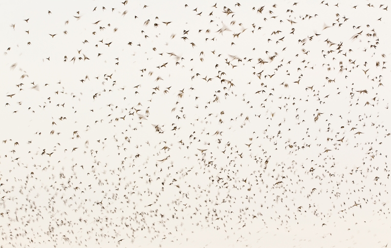
| This image was created on the morning of Sunday, September 4, 2011 with the Canon 70-200mm f/2.8L IS II lens and the 1.4X III TC (hand held at 150mm) with the Canon EOS-1D Mark IV . ISO 400. Evaluative metering + 2 2/3 stops: 1/60 sec. at f/11 in Manual mode. Central sensor/rear-focus AI Servo AF.
Lens/camera body Micro-adjustment: -8. For a greater appreciation of the image above, click on the photo to view a 1400 pixel wide version. Click on the enlarged version to close it. |
Another Sunday, Another Storm at Nickerson: A Storm of Swallows
Denise Ippolito and I arrived at Nickerson this morning at 5:30am but instead of the weatherman-promised clear skies and bright sun we were greeted by a grey sunrise and total overcast. And there were only a few small flocks of skimmers about. But within an hour we noted that huge flocks of migrant Tree Swallows were swarming in the dunes and in the featureless skies. To say that we had a ton of fun would be an understatement. As you take in the images note the variety of lenses and focal lengths used, the shutter speeds, the the manner in which the exposure was determined.
| [Not a valid template] |
|
This image was created as I lay prone in the damp sand behind with the tripod-mounted Canon 800mm f/5.6L IS lens and the EOS-1D Mark IV. ISO 400. Evaluative metering +2 stops: 1/125 sec. at f/5.6 in Manual mode. Two-sensors below the central sensor/rear-focus AI Servo AF. |
The image above would qualify as a serendipitous blur. When I saw the bird take off I fired. A quarter inch of wingtip and a smidge of canvas was added on our left.
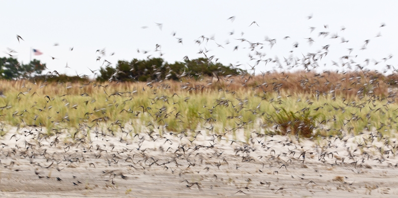
| This image was created on the morning of Sunday, September 4, 2011 with the This image was created with the Canon 70-200mm f/2.8L IS II lens and the 1.4X III TC (hand held at 150mm) with the Canon EOS-1D Mark IV . ISO 400. Evaluative metering + 2 2/3 stops: 1/80 sec. at f/5.6 set manually. Bottom center sensor/rear-focus AI Servo AF. |
In the image above I like the placement of the bush on our right, the position of the flag in the frame, and the bird in full downstroke just to the left of the flagpole.
For a greater appreciation of the image above, click on the photo to view a 1400 pixel wide version. Click on the enlarged version to close it.
| [Not a valid template] |
|
This image was also created as I lay prone in the damp sand behind with the tripod-mounted Canon 800mm f/5.6L IS lens with the 1.4X III TC and the EOS-1D Mark IV. ISO 400. Evaluative metering +1 2/3 stops: 1/80 sec. at f/8 in Manual mode. Central sensor/rear-focus AI Servo AF and re-compose. |
The bird in the image above is a bird of the year.
Which is Your Fave?
Take a moment to leave a comment and let us know which of the four images above is your favorite, and why.
Shopper’s Guide
Below is a list of he gear used to make the three mages in this post. Thanks a stack to all who have used the Shopper’s Guide links to purchase their gear as a thank you for all the free information that we bring you on the Blog and in the Bulletins. Before you purchase anything be sure to check out the advice in our Shopper’s Guide.
Support both the Bulletins and the Blog by making all your B & H purchases here.
Remember: you can earn free contest entries with your B & H purchases. Eleven great categories, 34 winning and honored images, and prize pools valued in excess of $20,000. Click here for details.
Canon 70-200mm f/2.8L IS II lens. Man, I am loving this lens on my shoulder with the 2X III teleconverter. I also use it a lot with the 1.4X III TC.
Canon 800mm f/5.L IS lens. Right now this is my all time favorite super-telephoto lens.
Canon 1.4X III Teleconverter. The new 1.4X TC is designed to work best with the newer Series II super-telephoto lenses but it works just fine with the current lenses.
Canon EOS-1D Mark IV professional digital camera body. My two Mark IVs are my workhorse digital camera bodies.
And from the BAA On-line Store:
Black Rapid RS-7 Strap. This is a case of where have you been all my life? The RS-7 holds my auxiliary lens comfortably in place and instantly accessible.
LensCoats. I have a LensCoat on each of my big lenses to protect them from nicks and thus increase their re-sale value. All my big lens LensCoat stuff is in Hardwood Snow pattern.
LegCoat Tripod Leg Covers. I have four tripods active and each has a Hardwood Snow LegCoat on it to help prevent further damage to my tender shoulders 🙂
Gitzo GT3530LS Tripod. This one will last you a lifetime.
Mongoose M3.6 Tripod Head. Right now this is the best tripod head around for use with lenses that weigh less than 9 pounds. For heavier lenses, check out the Wimberley V2 head. (Note: Denise prefers the Wimberley head to the Mongoose.
CR-80 Replacement Foot for Canon 800. When using the 800 on a Mongoose as I do, replacing the lens foot with this accessory lets the lens sit like a dog whether pointed up or down and prevents wind-blown spinning of your lens on breezy days by centering the lens directly over the tripod.
Double Bubble Level. You will find one in my camera’s hot shoe whenever I am not using flash.
Be sure to check out our camera body User’s Guides here.
The Lens Align Mark II. I use the Lens Align Mark II pretty much religiously to micro-adjust all of my gear an average of once a month and always before a major trip. Enjoy our free comprehensive tutorial here.
BIRDS AS ART Camera Body User’s Guides. Why spend $2-5 grand on a camera and not learn to use it properly and efficiently?


I really like the single blurred swallow #2. I find that it is unique and if your were not told what it is it would generate debate and conversation. It is a real nice image.
Artie, for me it’d be a close race between #1 and #3. I like number one for the sheer scope of it…the hundreds of silhouettes, each with its unique pose. I like number two for the depth and layering color…and the colors and sense of movement provided by the skimmers. Like you, I like the bush on the right (one more element providing depth, as well as an anchor point in the image); the flag is just a bonus!
#3 is my favorite – I love the layers of color.
Artie: I apologize for my rude comment. No excuse.
David
One of the images in the rotating set of images at the head of this web page is of blurred white birds against trees in fall colors. I just love it!
David
Even before I read the comments below I realized that viewing intentional blurs of large groups of birds at 800 wide just does not cut it. So I worked with Peter Kes to improve things. Thanks Peter. The following note now appears below images 1 and 3:
For a greater appreciation of the image above, click on the photo to view a 1400 pixel wide version. Click on the enlarged version to close it.
If seeing the enlarged versions changed your mind about either blur, do let us know. If you hate all blurs as a matter of fact or is they give you headaches, no need to chime in 🙂 artie
Hard to pick a favorite but I love #1 and wish it were mine. It was a wonderful morning. I am still going through the boat-load of images. The last image is killer too.
Thanks D. We surely had a great day. Do see Denise’s blog post on our day: A Great Day at the Beach.
I agree in general with the comments, including that you are a very talented photographer and wonderful teacher. I’ve taken photos like # 1; I like it but wouldn’t put it on my wall. Images 2 and 3 would have been deleted in the camera; to me, they are failed shots.
In either case I do believe that you might have deleted a potential contest winning image and at the least, lost some potential sales.
The blur is distracting and even the background is blurred in # 3 (can’t see it in # 2). I see no pleasing pattern or shape in them. I like # 4 the best–that bird does not look happy!–but again, it wouldn’t go on my wall.
The images and comments bring two issues to mind. The first, as always, is that we’re talking about art (and Art 🙂 ) and what pleases me isn’t necessarily what pleases you. That doesn’t make it right or wrong.
The second is the importance of the subject itself and of what the subject is doing. I have a photo of an adult male rufous hummingbird displaying his brilliant yellow-orange gorget. It does get people’s attention and I like it myself. (And it took patience, planning, and persistence to get it.) A similar photo of an immature or female hummingbird in the same pose in the same place wouldn’t be noteworthy, even if the image were technically identical to the first one. On the other hand, a fine sharp image of a hummingbird in an interesting pose feeding at a flower with a nice background could be good whether or not the bird had brilliant colors. David
I am not sure that I agree and not sure what your comments in the last paragraph have to do with the price of beans 🙂 artie
You are a very talented photographer and a wonderful teacher. I very much enjoy looking at your work, but the blurs give me a headache.
You can either not look at them or take a few of your standard headache remedies 🙂 artie
I’m diggin’ 3 and 4. 3, because it captures being in a storm of swallows, and 4, because he’s molting so beautifully and connecting so well with the viewer.
Hey Zick. Great to see you here. With regards to #4, do educate us if you see my reply :). What feathers is the large, newly molted blue on with the wide white fringe? What tract are the five brown ones below that one, the ones with narrow white edgings. How about the two dark pointy ones? Are the molting primaries or tertials? artie
Note: Julie is a skilled professional avian artist and natural history writer and is one of the five contest judges. You can learn more about her by clicking here and then on Judges.
Fraid I would have got rid of the flag in No.3 (I am British!!), but I think the small splash of colour spoils the frame. I would have to go with 4 and despite not really liking blurred shots normally, No 2 would be my second choice.
Creating a version without the flag is surely an option but I do feel that it adds to the compositional balance. artie
I can only echo Kathleen Anderson’s comment.
I like #2 and #3 the best with the edge going to #2. The bird fills the frame and the blur is pleasing – it makes the picture. Everything just blends together in the picture. My vote goes to the second picture.
#4 is the winner, for me…
He’s such a cutie ..and he has Attitude… Love it!!
The photo’s not bad either… Just kidding,
He(?)’s terrific and so is the shot. Kudos!!
I like the birdscape in number 1 most …
Hi Andy, I would call #1 a true pattern-type image and #3 a bird-scape.
And the sharp portrait number 4 second. The blur is a little too “blurry” for me and number the bg in number 3 is distracting to me. I take 1 over 4 because the birdscape best captures the magnitude of such a scene. Looks like a fun morning.
It was great. Thanks for stopping by. artie
I am going with number three. I am usually not a big fan of blurs, but the American flag got my patroitc juices flowing. I can be down right “Gung-Ho” about the American flag. I think, for patriotism only, I would have gone with a bigger flag, but then that wasn’t your subject, and it would have been a long run to get a bigger flag. 🙂
I have a question about number 4. Of course, this is another one of your sharp images with great detail, but you say, “this is a bird of the year.” Ok, so I am a rookie, but what is it, and what is a bird of the year?
A bird of the year is one born a few months ago in the current year’s breeding season. The bird in #4 is probably no more than 6 weeks old. artie
I liked the 4th (last) one best because of the sharp image.
I like number 4, I still prefer sharp images of the bird. Number 3 is second, like the feeling of the multitude of birds, the flag is an added plus, like “finding Waldo”, you don’t see it and then you see it first.
I like number 3 because it is like the scene at home. See my blog here.
Cool job on the video Myer. You needed more birds in your “swarm” image (which BTW, is underexposed as presented; you need to add light for those sky images even with Nikon :)) artie
I like the fourth one best.
The birds are just so small in the first one, the face a little too blurred in the second one, and the background is too distracting in the third one. I see what you mean about the bird to the left of the flagpole in the third one but I had to really search to find the flagpole!
Much as I like some blurred images I still go for the sharp ones first.
Do take a gander at the two new larger versions of the intentional blurs. artie