|
|
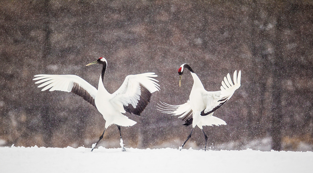
This image was created in Hokkaido, Japan on my first trip with the predecessor of the Gitzo 3532 LS carbon fiber tripod, Mongoose M3.6 head, the Mongoose M3.6 head, the Canon EF 800mm f/5.6L IS USM Autofocus lens and the EOS-1D Mark IV (now replaced by the Canon EOS-1D X). ISO 400. Evaluative metering +1 1/3 stops as framed: 1/1250 sec. at f/5.6 in Manual mode. Central sensor expand to 45 point/AI Servo Rear Focus AF as framed active at the moment of exposure. Click here to see the latest version of the Rear Focus Tutorial. Click on the image to see a larger version. |
Red-crowned Crane Image–Need Your Help/Opinion
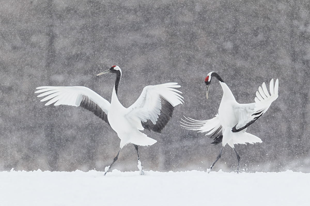
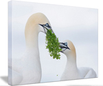
Do you like the pano crop above (Image #1) with room behind the right hand bird or the more traditional 3X2 crop below (Image #2)? Or something in between?
Do you like the more contrasty image above (Image #1) or the softer, less contrasty image below (Image #2)? Or something in between?
Do you like the richer colors above (Image #1) or the more muted colors below (Image #2)? Or something in between?
|
This is the same image re-converted in DPP and then optimized in a different fashion. To learn why I now convert all of my images in Canon Digital Photo Professional click here. |
Little Estero Lagoon
|
|
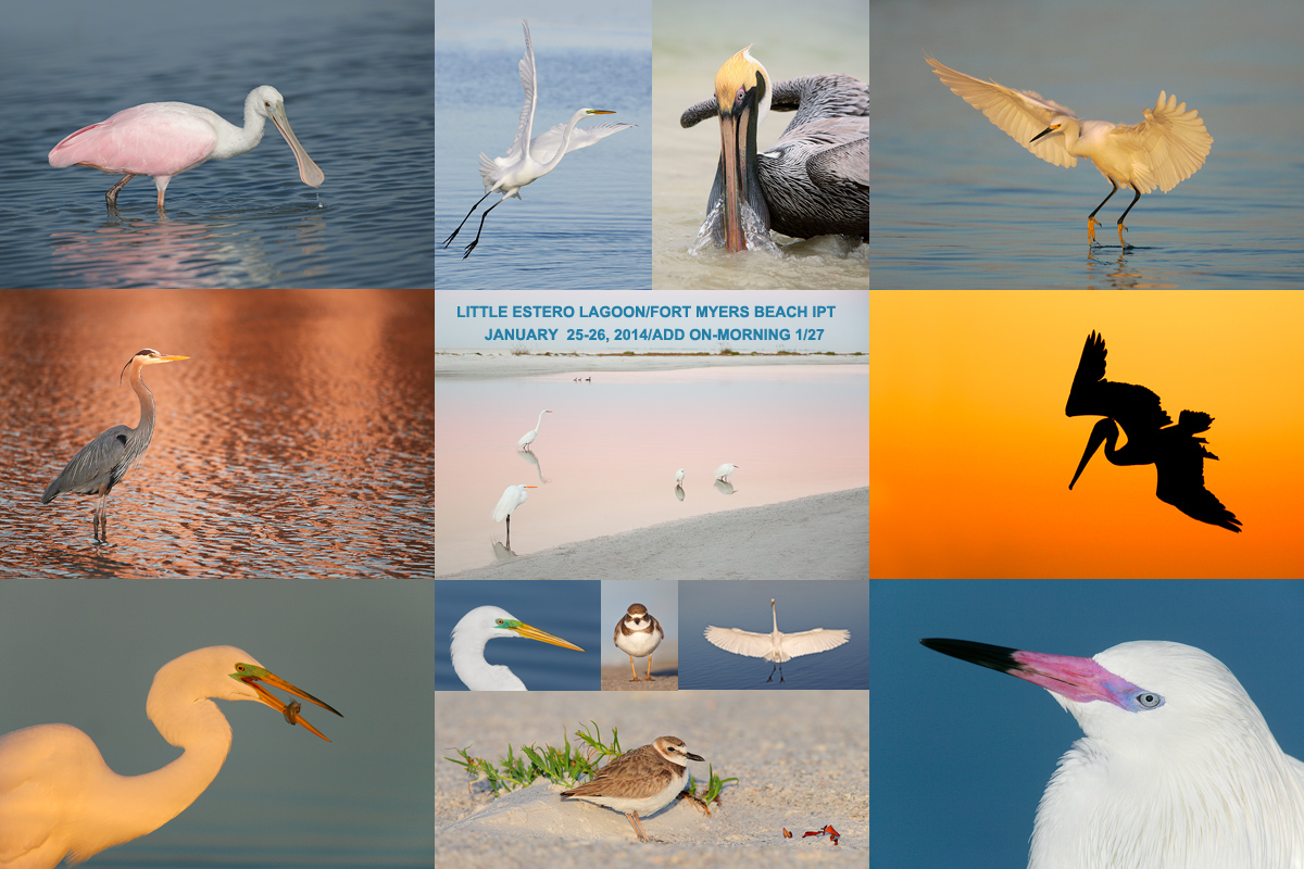
Join us to learn the ins and outs of Little Estero Lagoon. |
Little Estero Lagoon IPT: 2 full days–Sat/Sun: JAN 25-26 (Limit 14/Openings 12): $799. Introductory slide program: 7pm, FRI, JAN 24, 2014
Join Denise Ippolito and Arthur Morris for four great photography sessions at one of the top bird photography hotspots in North America. Morning sessions: 6:15am to 10:30am. Afternoon sessions: 3:00pm till 5:45pm. Lunch included. Informal image review and Photoshop sessions after lunch. Call 863-292-0906 to registger; payment if full is now due so call with your credit card in hand. Please e-mail with any questions.
What you will learn:
When to be where and where to be when at Little Estero Lagoon to maximize the photographic opportunities.
Autofocus basics and correct camera and gear set-up.
How to get the right exposure with digital every time.
How and why to expose to the right.
How to create pre-dawn silhouettes.
How to design pleasing images.
How to find the best perspective.
How to make strong images in cluttered situations.
How to photography birds in flight.
In-the-Field creative techniques.
Monday: Jan 27: Optional Estero Add-on/morning only (Limit 14/Openings 12): $249
Adding the last morning as above is optional.
Do consider joining us for the all or part of the South Florida Composite IPT:
2014 South Florida Composite IPT: 6 1/2 days of photography spread over 9 days of learning, hanging out, and travel: $2644. (Limit 14/Openings: 12
Click here for complete details or to register. Please e-mail with any questions or leave a comment below.
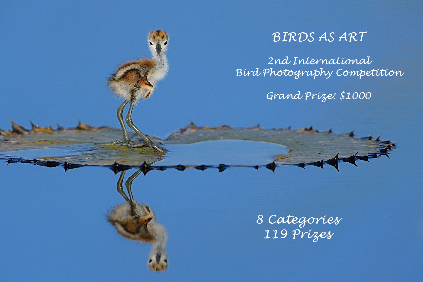
Last Year’s Grand Prize winning image by Lou Coetzer
|
BIRDS AS ART 2nd International Bird Photography Competition
The December 31, 2013 closing deadline is fast approaching.
Learn more and enter the BIRDS AS ART 2nd International Bird Photography Competition here. Twenty-five great prizes including the $1000 Grand Prize and intense competition. Bring your best.
Support the BAA Blog. Support the BAA Bulletins: Shop B&H here!
We want and need to keep providing you with the latest free information, photography and Photoshop lessons, and all manner of related information. Show your appreciation by making your purchases immediately after clicking on any of our B&H or Amazon Affiliate links in this blog post. Remember, B&H ain’t just photography!


Amazon
Everyone buys something from Amazon, be it a big lens or deodorant. Support the blog by starting your search by clicking on the logo-link below. No purchase is too small to be appreciated; they all add up. Why make it a habit? Because I make it a habit of bringing you new images and information on an almost daily basis.
Typos
In all blog posts and Bulletins feel free to e-mail or leave a comment regarding any typos, wrong words, misspellings, omissions, or grammatical errors. Just be right. 🙂
IPT Info
Many of our great trips are filling up. You will learn more about how to make great images on a BAA IPT than anywhere else on the planet. Click here for the schedule and additional info.





Definitely #2. Although #1 shows more of the environment, IMO there is too much space on the RHS which draws your eye away from the dance of the cranes and out the frame. I much prefer not only the crop of #2, but also the more muted, softer color palette which gives it a beautiful artistic look and focuses all your attention on the cranes.
#2 On all counts!!
#2 as it is. Plus, didn’t that win an award or something?
If so, all the better reason to go with #2.
Doug
Hey Doug, Close on the award but no cigar :). I will reveal all later this week. There is lots more learning to come.
I really like the crop of #1 and the feel of #2. The pano crop gives much more room for the cranes to continue their dance. The softness of #2 mimics the soft, fluidity of the dance. I don’t like the high contrast in #1 when you’re in a snowstorm.
I like #2 on all accounts
The first image has a natural feel to it, the second feels a little tight.
Definitely #2. Although #1 shows more of the environment, there is too much space on the RHS which draws your eye away from the dance of the cranes and out the frame. I much prefer not only the crop of #2, but also the more muted, softer color palette which gives it a beautiful artistic look and focuses all your attention on the cranes
I prefer the first one. Love the warmer tone and more of an environmental image. Gorgeous. Would perhaps like to see more space in front of Cranes and less behind them.
Like some of the others, I like the #1 for the contrast/colors and #2 for the crop, although I’d put a little more space on the right.
Beyond that, I’d like to see more detail recovered from the white on the birds, if possible. At least on my monitor. 🙂
I would like to see the image with richer color on the muted softer background with more space behind the bird on the right. That would be sweet.
I really prefer the second image – more realistic and artistic – almost painterly. The birds in the first image seem more “blown out” is the best way I can describe it. To me personally it is not as calming to look at as the second edit.
The cranes of #1 in the image #2; i.e a little more contrast and pop on the birds in #2. The background in #1 looks a bit “unreal” given the weather conditions (where’s the color coming from in a “whiteout”?) and the pano crop leaves me with the impression of “two birds dead smack in the middle”. The tree outline in the background (right) of the pano crop is a bit of a distracting element too.
I agree. The cranes of #1 with the more muted background of #2.
I like the first image the best because the darker BG gives the Cranes a little more pop.
It’s amazing that any combination appeals to someone. I’ll take #2 crop with #1 contrast and colors.
I preferred the first one , everything look naturally and wonderful , the space at the right side is perfect ….
I know this does not helps, however, if this these were my work. I would retire after taking them. Just wonderful, magical, poetic, lovely photos ( captures). The comment about the space to the right is likely on point. However, one can find fault with the Mona Lisa.
Work to really be proud of. Wonderful.
The second image is probably “like it was” – damned cold! The first image “puts the dancers on the stage”. Both the dancers and the stage are spectacular. Both images stopped me and made me really look.
Arthur, I prefer Photo Two and would crop, apply richer colors and more narrow snow “field” bottom of image. Depending on how the richer colors appear, the blurred forest muted brownish tone may enhance the Cranes prominence in the scene providing more contrast and depth. The white tones of the Cranes and the white tones of the forest put both components in the same plane. I think more separation is needed similar to separation with image one.
Thank you and Merry Christmas to all. Jim Amato
Number 1. Elegant! Shows the dance/ballet -like aspect in beautiful context. #2 looks a little blown out and pale. It loses the rhythmic feel of #1. Do you want them going uphill in #1?
I like image #1, the added background environment,, color and contrast are more appealing to me.
Cranes are my main subject, which may make the choice more difficult! The subdued colors in #2 are lovely and give a better feel of cranes in the midst of falling snow in Hokkaido, at least as I have experienced it. However, #1 is my favorite, as you have given the cranes room to dance and shown the “stage” on which they are dancing. So it is a more representative view of dancing Red-crowned cranes and I find the dancing to be more compelling than viewing cranes in falling snow.
#1 is definitely my favorite though I do not find the second image the lest bit objectionable….
I prefer #1 on all three counts. Really nice!
For me the pano with the subdued processing of the 3×2 would be ideal.
Tough choice, partly because there are other differences also. I am not keen on the extra space on the right of the pano crop. I do like the extra environment though. I like the first image cropped just to the right of the largest dark tree on the right. Take out the brown lump, leave the tree and a smidge of the mottled BG. I also like the color version better, the cranes stand out more.
Should have added that the 2nd as presented feels a little tight.
Image #1. More appealing tones of the birds, the background, and the snow. Also less background and less snow…which helps focus attention on the gorgeous cranes. I’m not bothered by the slightly tilted snow line…in Image #1, where you can definitely make out the trees, it is clear that the trees are straight up and down, so the snow line reflects the fact that the birds were on a slight hill.
Dear Art,
Definitely #1 i like the overall color contrast but above i do feel the movement of the birds more then in number 2…they have more room to dance….
Love the shot.
Best regards.
Picture #1 in all three categories, especially the aspect ratio!
Hi,
I go with # 2 by far, much more pleasing all around.
Don
#2 for me with the brownish color of the first one. In #1, too much dead space behind the bird that attracts our eye and get us out of the main subject here, which is IMO : the dance of the birds.
Add more details in the snow in the FG.
Aha nice comment…another way to look at the dance…
Regrads.
Spencer
I mean regards of course.
Excuse me for the typo:-)
#1 for the space and the colours but not the slanted ground.
Definitely #1. Better contrast and colors. Tells more about the environment.
To my eye, picture #1 is infinitely more appealing. The composition is delightful, as is the color palette. The space around the ghostly birds, the trees, all of it delights without overwhelming. There’s an ethereal poetry to the image that transcends traditional bird photography; it’s really quite something! HOWEVER: to my eye the image is too contrasty, and I would ease up a little bit in that department. Lovely; kudos!
I prefer the second image. The first one has too much dead space on the right for me.
Marv
The saturation in the red from #1 and the contrast and crop of #2
Dear Art:
I prefer everything about #2 — the crop, the softer image (the other seems artificial to me)and the muted colors! I find the blackish blobs really distracting in #1
Happy HolidayS
I prefer the #2 crop, only because there’s too much space on the right side of the pano crop. As for processing, I generally prefer a bit more contrast and color saturation, but, in this case, I think somewhere in between; the softer, more muted tones of #2 are more appropriate to the mood of the image, but a bit more contrast & saturation would be a bit more interesting (I think, without actually seeing it). All of that said, the fundamental image is fantastic.
Hard to choose. I like seeing a little more habitat in #1 but #2 strongly brings out the elegant dance which has lots of impact. As for colors, I’d like less red in #1 and just a bit less blue in #2
I prefer both the crop and the color palette of the second image
I like #1 for the colors and the pano. #2 wold be great as a B&W
Prefer treatment in #1 with #2 crop and straighter snow line.
I prefer the 2nd crop and the richer colors in #1
definitely #2. Too much dead space in number 1 and I prefer the muted, more natural reds.