|
|
Lots More on Sleeping Dunlin Compositions…. Lots!
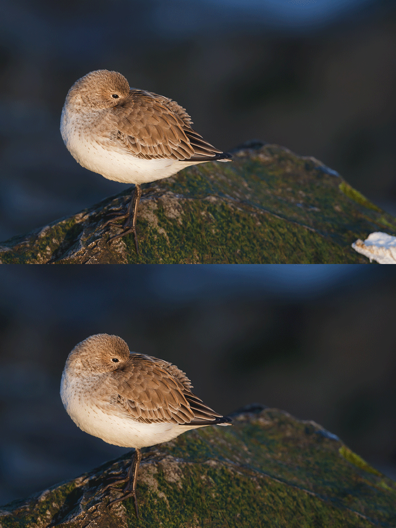
My general preference when photographing sleeping birds is to have them looking into the frame, that is, with 3-4 times more room between the tail tip and the edge of the frame than between the back of the head and the opposite frame edge. Thus, had it not been for the whitewash in the before image above, I would not have even created the top image in the Sleeping Bird Horizontal Composition post here.
The whitewash was covered with two Quick Masks as covered in Digital Basics. The fine points of Quick Masking are covered in Robert O’Toole’s APTATS I.
When I posted the two images my very great preference was for the second image (as it was at the time of creation). But reading all of your comments was quite interesting and educational; right now I like both of them quite a bit but still prefer the second one by a small margin. Seventeen folks liked the first image best and nine the second with Fabrizio abstaining (if such a thing is possible on a blog). Remember: there is no right or wrong answer.
Why did I/do I prefer the second image? As above, I like a resting or sleeping bird with room to see into the frame. And I like the expanse of seaweed covered rock. The first image does look cleaner. And the bird’s body more square to the imaging sensor in the first image. And the light area of sky in the second image is a bit distracting. OK, I give; let’s call it a tie.
Now let’s take a look at some of the relevant comments.
My student friend Monte Brown wrote in part, “On my monitor it appears the bottom toe has been clipped in the second image.”
| [Not a valid template] |
|
Monte, you should know me better than that! There is a bit less room below the lowest toe in the second image than in the first but no toe-clipping at all 🙂 |
Subhrashis, Joerg, KD (Kaustubh Deshpande), and Brian Powell all suggested that getting lower would have improved the image by eliminating the merge between the bird’s lower belly and the rock. And all were correct. Jon Ashton suggested the same thing via the Clone Stamp Tool. It would have been a lot easier to get a foot lower in the field than to try to work along the feather edgings…. I was standing at full height behind my tripod and could have gotten lower; I just did not notice the merge. I hate setting up low on the Barnegat Jetty as it is tricky getting up and down and more difficult to move around as you are slower in getting started. In addition, getting low may introduce more foreground rocks with perched shorebirds and more foreground waves with swimming sea ducks (especially on choppy days).
Justine wrote in part, ” Perhaps a vertical framing would have improved these images as well. I’ve just started following your blog and website, Artie, and am enjoying it very much. Thanks.” First off, YAW and thanks for your kind words. As for a vertical here, all that I can say is that great minds think alike. (See image last….)
Fabrizio wrote, “On the other hand, I’m attracted by the bird’s feet. They seem to be strongly grabbing the rock to avoiding slipping away… that’s why I’m more interested in the downside of the slope. I’d be curious to see a third shot similar to the first, but with the bird more upward and more slope.” I think that the image below addresses his concerns….
| [Not a valid template] |
|
It should be noted that all of the images were made with my moving the tripod and without the bird having moved an inch. And do note that they use of Manual mode here was imperative; once I had the exposure right for the bird I simply set 1/250 sec. at f/8 manually and did not have to worry about the proportion of water to rock. |
What I love most about the vertical image are the diagonally oriented rock edges that point roughly up at the subject. I do believe that this is the strongest of the three images by far. If only I had gotten low enough to avoid the rock/belly merge.
Thanks a stack to all who shared their thoughtful and creative opinions in the comments section.
Shopper’s Guide
Here is a list of the gear that I used to create the images above. Thanks a stack to all who have used the Shopper’s Guide links to purchase their gear as a thank you for all the free information that we bring you on the Blog and in the Bulletins.
Canon 70-200mm f/2.8L IS II lens A versatile intermediate zoom that I have been in love with since I first picked it up 6 months ago.
Canon 800mm f/5.L IS lens Right now this is my all time favorite super-telephoto lens.
Canon EOS-1D Mark IV professional digital camera body And this is the very best professional digital camera body that I have even used.
Canon 1.4X II teleconverter This is my most used accessory; I would be lost without it.
Canon 2X II teleconverter I love this combined with my 70-200mm f/2.8L IS lens; Canon’s lighter version of the Nikon 200-400!
And from the BAA On-line Store:
Gitzo 3530 LS Tripod This one will last you a lifetime.
Mongoose M3.6 Tripod Head Right now this is the best tripod head around for use with lenses that weigh less than 9 pounds. For heavier lenses, check out the Wimberley V2 head.
Double Bubble Level You will find one in my camera’s hot shoe whenever I am not using flash.
Delkin 32gb e-Film Pro Compact Flash Card Fast and dependable.
NEOS Navigator 5 Insulated Overshoes My brand new pair of NEOS Navigators kept me warm and dry and provided safe footing and a good grip on the slippery jetty rocks.
If you are considering the purchase of a major piece of photographic gear be it a new camera, a long lens, a tripod or a head, or some accessories be sure to check out our complete Shopper’s Guide.


Agreed. The vertical seems strongest to me also. It lets you know the bird is clutching onto a steep slippery rock giving more interest to the scene. And no light spots in the sky. I don’t mind the bird’s tail being in front of the rock. Tail is sharp–rock is blurred so the tail stands out and gives a feeling of depth that might not be there if the bird was all against the water.
Thanks for this idea of reader comment. More learning!