|
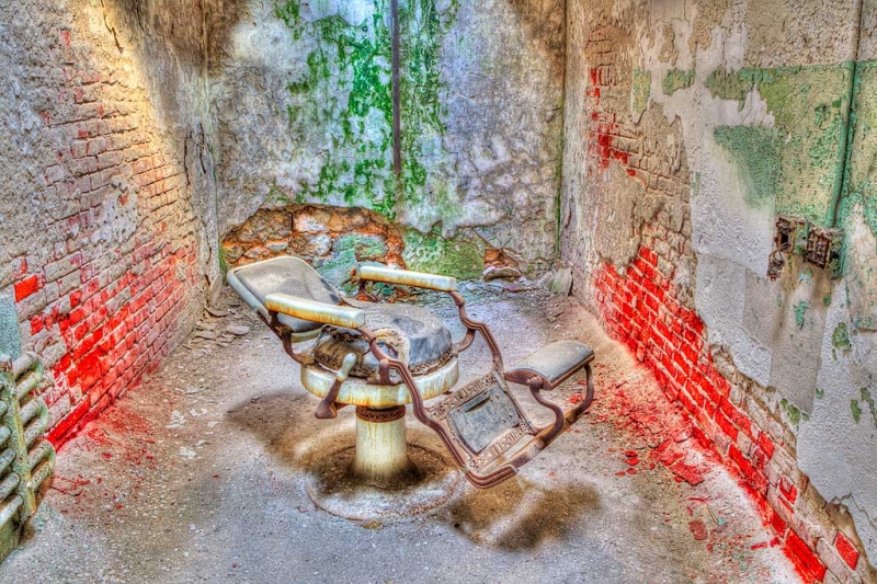
This image was created on Denise Ippolito’s Creative Photography workshop at the now derelict Eastern State Penitentiary in Philadelphia, PA with the Canon 24-105mm L IS lens at 24mm and the EOS-1D Mark IV. ISO 200. Evaluative metering: 7-frame AEB +/- 1 stop around -1 stop: 1.6 seconds at f/16. 2 sec. self timer. Live View (for Mirror Lock). Gitzo 3530 LS CF tripod, Giottos MH 1302-655 BallHead, Wimberley P-5 camera body plate. For a greater appreciation of the image, click on the photo. Then click on the enlarged version to close it. Learn about Denise’s next ESP workshop (October 15, 2011) here. |
Need A Haircut?
This was one of several “barbershop” cells where inmates went for haircuts. The quasi-HDR Grunge was created in Photomatix. To purchase Photomatix and save 15% click here and be sure to enter birdsasart as the coupon code. You can download and use a trial copy of Photomatix before you buy. (It is fully operational; the processed images will have a visible watermark on them.) I was intimidated by both HDR and HDR Grunge for several years but once I tried each I quickly got the hang of it. And it is great fun. If I ever finish my 2010 taxes I will get to work on the HDR Grunge Guide that Denise and I are writing.
Like It or Hate It?
Like it or hate it? Either way, be sure to let us know why.
Canon 300 f/2.8L IS II B&H Alert, and More
The release of the eagerly-awaited Canon 300mm f/2.8L IS Version II lens was delayed by the earthquake tragedy in Japan. If you are looking for one, be advised that B&H just received a small shipment. To purchase, please use this link: Canon 300mm f/2.8L IS II lens and earn three free entries into the BIRDS AS ART 1st International Bird Photography Competition.
COOLPIX P7100 Digital Camera. Just arrived: in stock and ready to ship at B&H’s always low prices.
Coolpix AW100 Waterproof Digital Camera. Just arrived: all colors in stock and ready to ship at B&H’s always low prices.
Shopper’s Guide
Below is a list of the gear used to create the image in today’s blog post. Thanks a stack to all who have used the Shopper’s Guide links to purchase their gear as a thank you for all the free information that we bring you on the Blog and in the Bulletins. Before you purchase anything be sure to check out the advice in our Shopper’s Guide.
Support both the Bulletins and the Blog by making all your B & H purchases here.
Remember: you can earn free contest entries with your B & H purchases. Eleven great categories, 34 winning and honored images, and prize pools valued in excess of $20,000. Click here for details.
Canon 24-105mm L IS lens. I never head into the field without this versatile B-roll lens in my X-trahand vest.
Canon EOS-1D Mark IV professional digital camera body. My two Mark IVs are my workhorse digital camera bodies.
And from the BAA On-line Store:
LegCoat Tripod Leg Covers. I have four tripods active and each has a Hardwood Snow LegCoat on it to help prevent further damage to my tender shoulders 🙂
Gitzo GT3530LS Tripod. This one will last you a lifetime.
Giottos MH 1302-655 BallHead. This lightweight “tiny” ballhead is ideal for both Wimberley and Mongoose users who, on occasion, need to get their cameras on the tripod.
Double Bubble Level. You will find one in my camera’s hot shoe whenever I am not using flash.
Be sure to check out our camera body User’s Guides here.
The Lens Align Mark II. I use the Lens Align Mark II pretty much religiously to micro-adjust all of my gear an average of once a month and always before a major trip. Enjoy our free comprehensive tutorial here.
Canon EOS-1D Mark IV User’s Guide. Learn to use your Mark IV the way that I use mine.


I wish we could ‘like’ posts here like you can on FB. LOVED John’s post – learned much. Thank you 🙂
I like the image very much but agree with the “lower saturation” crowd. These kinds of images are great fun to play around with in Photomatix and I like to put the finishing touches on back in Lightroom.
Artie, I’m late to the party…this is a tough one to call. Things I really like: the rich textures that are everywhere…the stark feel to the place that is accentuated by the centered composition and the simplicity of lines…the play of light and shadow on the LHS and on the floor…and the conduits on the wall that are accentuated by moss/lichen and decay. What is a little unsettling…the bright reds (mentioned by others)…and the bright whites on pedestal of the chair (I’d probably tone them down a bit). The tension in the image is the decaying state of everything and the stark sense of loneliness; I’m caught trying to decide if the lighter tones heighten that tension or play against them…if darker tones and shadows might play to the composition more. Either way, it makes you think..and a good basis for discussion!
Like the shot and look, but too bright and garish for me. Kind of makes my eyes hurt.
Thanks Ladies D & G and guy Andrew and all. artie
Very nice composition and the shadow is killer! I think you could darken the reds a little and still keep the look you want for this. You were great fun to have along at the workshop and you have a great eye!
I had to come back to this. I like it because the festive red/green color really contrasts the idea of the place. I love the saturated colors, the way the red sort of cradles the chair, and the green gives an indication of life, at some point 🙂
Dang, that’s a cool shot. Fabulous comp (!).
I can appreciate the work but for me it is OTT.
OTT? artie
Not keen at all – sorry. Mainly because the colours are far too saturated for my liking, especially the red.
Like the image very much except think the bright red is too much. I think it would be stronger if the red was desaturated to keep with the grungy look. The grunge effect is perfect for this image!
My e-mail address has changed to enterkij@charter.net. I could not find another place to try and get it changed. Hope this works. Jim Enterkin
Hi Jim, Did you try clicking on the drop-down menu for “Subscriptions” on the right side of the upper yellow bar on the home page of the blog?
Killer colors and comp. You have these quasi-grunges perfected. It really accentuates the detail in the bricks and mortar, not too mention the moss on the walls. Beautiful work!