|
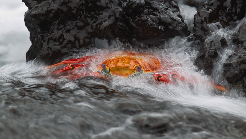
After seeing an Andy Rouse image of a Sally Lightfoot crab on black lava rock surrounded by a blurred wave (in his book, Concepts of Nature, I was determined to try something similar (and perhaps better) on my next Galapagos visit. This image was created with the tripod-mounted Canon 800mm f/5.6L IS lens and the EOS-1D Mark IV. ISO 50. Evaluative metering -2 stops off the crab on the black rock alone: 1/30 sec. at f/9. (I knew that I would need to underexpose quite a bit to avoid losing detail in the white water of the breaking waves; I needed to check the histogram a few times to get it right.) For a greater appreciation of the image, click on the photo. Then click on the enlarged version to close it. |
For Your Critique: Image #14
The image above is presented for your critique; feel free to praise it or rip it to shreds. Would you keep it or delete it? Let us know why either way, what you like or what you hate. What would you have done differently?
Over the course of the next few weeks I will present six additional images in this series for a total of twenty in all. The last will be followed by several revelations including two major ones.
An important point here: I have written often that one of the very best ways to grow as a photographer is to look at as many good images as possible. I do that often in books, by checking out contest web sites, by critiquing images on Bird Photographers.Net (BPN), by visiting the web sites of the world’s best photographers, and by encouraging image sharing during Instructional Photo-Tours (IPTs).
Second important point here: if you would like to learn a variety of techniques that you can use to create pleasing blurs–they are very rarely serendipitous accidents–get yourself a copy of “A Guide to Pleasing Blurs” by Denise Ippolito and yours truly. Like em or not, pleasing blurs do well in the major international nature photography competitions.
Support both the Bulletins and the Blog by making all your B & H purchases here.
B&H On-Line ordering is available six days a week (Sunday through late Friday afternoons) as usual. More and more folks are earning multiple contest entries with their B & H purchases. See here for details on that. Eleven great categories, 34 winning and honored images, and prize pools valued in excess of $20,000. Click here to visit the competition home page.
Shopper’s Guide
Below is a list of the gear used to create the image in today’s blog post. Thanks a stack to all who have used the Shopper’s Guide links to purchase their gear as a thank you for all the free information that we bring you on the Blog and in the Bulletins. Before you purchase anything be sure to check out the advice in our Shopper’s Guide.
Canon 800mm f/5.L IS lens. Right now this is my all time favorite super-telephoto lens.
Canon EOS-1D Mark IV professional digital camera body. My two Mark IVs are my workhorse digital camera bodies.
And from the BAA On-line Store:
LensCoats. I have a LensCoat on each of my big lenses to protect them from nicks and thus increase their re-sales value. All my big lens LensCoat stuff is in Hardwood Snow pattern.
LegCoat Tripod Leg Covers. I have four tripods active and each has a Hardwood Snow LegCoat on it to help prevent further damage to my tender shoulders 🙂
Gitzo GT3530LS Tripod. This one will last you a lifetime.
Mongoose M3.6 Tripod Head. Right now this is the best tripod head around for use with lenses that weigh less than 9 pounds. For heavier lenses, check out the Wimberley V2 head.
CR-80 Replacement Foot for Canon 800. When using the 800 on a Mongoose as I do, replacing the lens foot with this accessory lets the lens sit like a dog whether pointed up or down and prevents wind-blown spinning of your lens on breezy days by centering the lens directly over the tripod.
Double Bubble Level. You will find one in my camera’s hot shoe whenever I am not using flash.
Be sure to check out our camera body User’s Guides here.
The Lens Align Mark II. I use the Lens Align Mark II pretty much religiously to micro-adjust all of my gear an average of once a month and always before a major trip. Enjoy our free comprehensive tutorial here.
Canon EOS-1D Mark IV User’s Guide. Learn to use your Mark IV the way that I use mine. User’s Guides are available for the 7D and the Mark III here. And for most Nikon dSLRs here.


Contrast of fiery orange against the b/w is beautiful.
Thanks almost all for your kind comments. I love, love, love this one. I made several similar nice ones on this year’s Galapagos trip. This one has done well in several contests. Will share the details in the future. artie
Yes Becky and Keith! The WET Highland Terrier! Phew. I thought it was just me.
I love these super colourful crabs, they are so photogenic and appear characterful! They have 360 degree vision by the way Fabrizio. And @ Harvey, it’s the natural history of the moment that makes this image stand out, the crab is gripping tightly to the rocks as the water rushes over it, and, like all crabs, it is always on the lookout for a tidbit that could be washed into it’s reach, and equally it is checking the sky and anywhere else for gulls etc.
Really like it with the contrast of colors and movement/steadiness. Believe it’s trying to decide whether to claw at you or not.
I think it’s a Wet Highland Terrier, Becky..!
😉
I like this every time I see it.
Outstanding. I second the suggestion to open the large version before making an idea of the photo; and please note that the eyes of the crab are perfectly visible (and looking at us). Maybe this is not immediate to us if we’re acquainted to eyes from bird or mammals. Eyes are what makes a big difference IMHO, making the photo really a photo of a crab, rather than a photo of the colors of a crab.
What caught my eye first was the blur of the water, and then the amazing colors of the crab. I like it!
Do you mean that West Highland Terrier with the big black nose?
I’ve been looking at this image all day. Does anyone else see a face in the rocks to the right of the crab just above it’s submerged leg?
I love it! The orange-red of the crab contrasts nicely with the black lava rock. Love the two-way water blur from the wave in front of the crab and the water flowing in from behind it too. Cool little waterfall on the right as well. I did have to pull out my copy of ‘Concepts of Nature’, which is a killer book, to compare the images. I like both Andy’s and yours equally 🙂
Great capture…very nicely done.
I really like the contrast of the colour against the black rock, and the contrast of the moving water and the rock. The water flowing over the rock has created a wonderful effect. And the crab is perfectly sharp. I doubt Andy would have gotten anywhere near as good 😉
This not a blur, the image is tack sharp. Make sure you click on the image to see the enlarged version
Sorry, I do not care for it. I see nothing but a mess of colors. I am not blur kind of of guy, but you have some great ones, this is not one of them.
Thanks for sharing your thoughts. For me, and for many others, this is a winner :). artie
I like the nearly B&W background and the contrasting hot colors of the crab. The bubbly goodness of the sea and waves retreating from the rocks leads the eye to the crab. I would prefer the image framed a little higher up the rocks to put the crab lower in the frame and reduce the large unfocused patch of sea in the lower left. It seems to grab my eye in spite of the crab and wave action.
Very nice shot with my eyes going straight to the eyes in the photo. I have been trying to get a good shot of fish spawning in the Spring and know how difficult it is to get the eyes above the water.
This is a vwery good shot. Exposure just right and good wave action.
An all-time favorite from the first time I saw it long ago. Brightly colored crab on white/grey/black is classical and always appealing. I don’t think anything needs improvement. I do though wonder if an angle from slightly to the left would be a tad more engaging. And if a frame with a little lower water in front would show the mouth parts. But I bet you would then loose the water across the back, which would hurt.
I really like this, in a lot of ways, the colors, the exposure, the subject.
Artie, in your description of the camera lens and settings you say “his image”. Do you mean “this image?”
This image tken at an aperture of f-9 gives the DOF necessary to keep the backof the crab and the rocks in focus, which is great. since the aspect ratio in the photo is no longer 2 to 3, you must have cropped it. Did you take off some of the top or some of the bottom? I would guess the bottom since the foreground water is nicely out of focus. The bright comors in the midst od what is almost a black & white is really eyecatching.
Thanks Jack fof catching my typo. I have fixed it. Yes to cropped a bit probably from top and bottom. artie
great capture!
Wonderful!
WOW!! What else can I say? A truly amazing image.I have not seen Andy’s but this image would be hard to beat.
Gorgeous . . . especially when viewed enlarged.