|
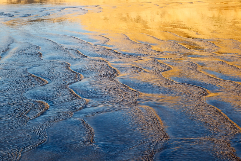
This image was created with the Canon 24-105 IS L zoom lens (hand held at 60mm) and the Canon EOS-1D Mark IV. ISO 400. Evaluative metering +2/3 stop: 1/50 sec. at f/22 in Av Mode. This image was created in LaJolla, CA on the 2011 San Diego IPT. One-Shot AF and recompose. For a greater appreciation of the image, click on the photo. Then click on the enlarged version to close it. |
For Your Critique: Image #19
The image is presented for your critique; feel free to praise it or rip it to shreds. Would you keep it or delete it? Let us know why either way, what you like or what you hate. What would you have done differently?
In a few days I will present one additional image for a total of twenty in all in this series. That will be followed by several revelations including two major ones.
One of the very best ways to grow as a photographer is to look at as many good images as possible. I do that often in books, by checking out contest result web sites, by critiquing images on Bird Photographers.Net (BPN), by visiting the web sites of the world’s best photographers, and during image critiques and by encouraging image sharing on our BAA Instructional Photo-Tours (IPTs).
BIRDS AS ART BULLETIN #390
BIRDS AS ART Bulletin #390 is on line and can be accessed here in spectacular white on black format. Here are the features:
- BOSQUE END OF NOVEMBER REPORT
- CANON REBATES!
- THE BLOG IS THE BOMB
- NIK COLOR EFEX PRO 4.1
- IPT UPDATES
Earn Free Contest Entries and Support both the Bulletins and the Blog by making all your B & H purchases here.
More and more folks are earning multiple contest entries with their B & H purchases. See here for details on that. Eleven great categories, 34 winning and honored images, and prize pools valued in excess of $20,000. Click here to visit the competition home page.
Shopper’s Guide
Below is a list of the gear used to create the image in today’s blog post. Thanks a stack to all who have used the Shopper’s Guide links to purchase their gear as a thank you for all the free information that we bring you on the Blog and in the Bulletins. Before you purchase anything be sure to check out the advice in our Shopper’s Guide.
Canon 24-105 IS L zoom lens. This is my everyday B-roll lens. It is always in my vest for grab shots, birdscapes, scenic images, close ups, and 100 other types of images.
Canon EOS-1D Mark IV professional digital camera body. My two Mark IVs are my workhorse digital camera bodies.
And from the BAA On-line Store:
Canon EOS-1D Mark IV User’s Guide. Learn to use your Mark IV the way that I use mine. Also available for the 7D and the Mark III here.
A Guide to Pleasing Blurs. Denise Ippolito and yours truly share dozens of the techniques that they use to create pleasingly blurred images of a great variety of natural history subjects.


I really like the abstract quality of this photo, and the colors together are wonderful. By the way, you know how you write above how one of the best ways to learn and to grow are to, among other things, visit the web sites of the world’s best photographers? Would love it if you would take a moment to list your top 5 or so.
Thanks for all you do and share, Artie.
Arthur, I love, love, love it! The blues and golden yellows are beautiful together and the gentle, rippled waves are quite nice too!
On first look, the brightness of the upper right gold really hit me. On further view, I really like the ripples, especially the ones along the top that lead to the (slightly too bright) gold. I would certainly keep it.
I love photographing water myself. This one just makes me feel good. Agree, large version is magnificent.
Dennis
It wouldn’t be nice if they were all “Wows”, that would detract from the real wow. 😉 I like the image – the tension created by the wavy, blue ripples leading into the serenity and stillness of the golden light is very attractive to me.
The play of the blues and golds in the photo is just stunning. The water ripple effect adds to the photo’s beauty. A real winner,Art.
Nothing to criticize. I really like it. I love looking at water, and being on it. Cheap windsurfer me.
I guess that I am negative. I see nothing and I do not care for it.
Hi Art, During the past few months that I have subscribed to your blog and bulletin I have become a huge fan. So much so that I have purchased several of your instructional ebooks and hardback.
For several weeks now you often mention that you are using NIK color Efex Pro 4.1 tonal adjustmets. I also like to use Nik and have the full suite of there software. Mainly for it control and automation of layers in PS. When I contact them about an upgrade to 4.1 they said that there is not a ver. 4.1 available at the current time. Just wondering if you have a pre-release that is coming out and if so what is new? Regards,
My bad. Brain typo. Sorry for that error. artie
Nice image. You gotta see it enlarged. It would make a beautiful mural.
This exemplifies rhythm. Wonderful colors.
Hi Art, When I opened the image what I saw first was the beautiful colors and the contrast between the blue and the golden yellows which is striking. However after these first impressions I find that the leading lines in the photograph go to a place in the left top corner where there is very little of interest going on. The interest is in the top right corner but the lines created by the waves do not lead me there.
Hi Nick. Nice to see you here. For me, the upper left has lots of interest and the ripples take my eyes right there. Different strokes… artie
This is an interesting shot visually. Even more interesting to me is the exposure data: I wonder, back in the days before you began pushing your histogram data as far right as possible, if you might not have given this shot -1/3 or even -2/3 less exposure than you did here. At any rate, the exposure is right on the money, with lots of detail in the shadow areas and no loss of highlight detail.
With digital we push the exposure to the right and then darken the usually washed out image. With film, you exposed to get the image to look exactly as you wanted it to appear… Probably zero or -1/3 stop from what I remember…. artie
I like the patterns,soft colors and textures.
Hi Art, I like this shot for a few reasons, first the patterns and textures are pleasing, the picture is framed or cropped to lead your eyes from dark to light, I like that. Although I don’t think it’s a “wow” shot it is a nice pleasing photograph
Art: I LOVE this image. I love the contrast between the blue and gold waves!! Ying, yang — I love it. Happy Holidays!