|
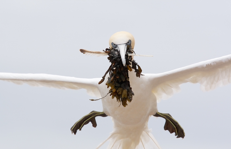
Northern Gannet landing with nesting material, Quebec, Canada. Created with the handheld Canon 400mm f/4 IS DO lens and the EOS-1D Mark III (since replaced by the EOS-1D Mark IV). ISO 400. Evaluative metering +2 1/3 stops off the grey sky: 1/1600 sec. at f/8 set manually. Central Sensor AI Servo AF on the shutter button; this image was made before I switched to rear focus full time. Click here if you missed the Rear Focus Tutorial. Lens/TC/camera body Micro-adjustment: +4. For a greater appreciation of the image, click on the photo. Then click on the enlarged version to close it. |
For Your Critique: Image #20
The image is presented for your critique; feel free to praise it or rip it to shreds. Would you keep it or delete it? Is the clipped tail a deal breaker for you? Let us know why either way, what you like or what you hate. What would you have done differently?
This is the last in the 20-image series. In a few days I will post the two major revelations.
One of the very best ways to grow as a photographer is to look at as many good images as possible. I do that often in books, by checking out contest result web sites, by critiquing images on Bird Photographers.Net (BPN), by visiting the web sites of the world’s best photographers, and during image critiques and by encouraging image sharing on our BAA Instructional Photo-Tours (IPTs). More on this subject soon.
Earn Free Contest Entries and Support both the Bulletins and the Blog by making all your B & H purchases here.
More and more folks are earning multiple contest entries with their B & H purchases. See here for details on that. Eleven great categories, 34 winning and honored images, and prize pools valued in excess of $20,000. Click here to visit the competition home page.
Shopper’s Guide
Below is a list of the gear that James used to create the images in today’s blog post. Thanks a stack to all who have used the Shopper’s Guide links to purchase their gear as a thank you for all the free information that we bring you on the Blog and in the Bulletins. Before you purchase anything be sure to check out the advice in our Shopper’s Guide.
Canon 400mm f/4 IS DO lens. This fantastic, relatively light 400mm f/4 lens that can be hand held is ideal for birds in flight and when photographing from all types of water craft.
Canon EOS-1D Mark IV professional digital camera body. My two Mark IVs are my workhorse digital camera bodies.
And from the BAA On-line Store:
LensCoats. I have a LensCoat on each of my big lenses to protect them from nicks and thus increase their re-sales value. All my big lens LensCoat stuff is in Hardwood Snow pattern.
The Lens Align Mark II. I use the Lens Align Mark II pretty much religiously to micro-adjust all of my gear an average of once a month and always before a major trip. Enjoy our free comprehensive tutorial here.
Canon EOS-1D Mark IV User’s Guide. Learn to use your Mark IV the way that I use mine. Also available for the 7D and the Mark III here.
|
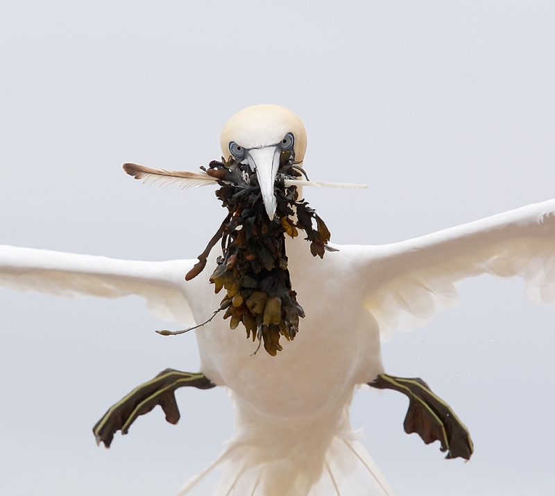
Cropped to a square as suggested in various comments. I believe that the image is stronger this way. Thanks Patty et al. |


I like them both but I’m a sucker for drama, and the closer crop is more dramatic. You can see the bird’s face better. So I prefer it. The asymmetry doesn’t bother me a bit. I spent a day recently on my boat in Chesapeake Bay photographing birds, including gannets. Got some good shots but nothing as unusual or dramatic as yours. My best were of Bonaparte’s gulls catching fish. A boat can be a good way to get to birds.
BTW Artie, This crop follows “Milton’s PORTRAIT RULE OF THIRDS” placing the bridge of the nose 1/3 down–centered. It leaves just the right amount of head space. It was meant for human portraits, but works well for anything including bugs & flowers.
Fantastic! Perfect crop. Leaving in the tail would have given the viewer more distraction from the eyes and mouthflul. This one doesn’t need critique. You knew you had it when you click the shutter.
With the full tail it would be better, but it’s definitely a keeper. It wasn’t easy for me to decide whether the square crop is better or not. At first I liked it because the bird’s head is larger, but this doesn’t depend much on the photo, rather on the page setup of the website. So I managed things so I could see the bird’s head at the same size in both photos. At this point I prefer the original one. See more wings in gliding configuration gives me a stronger feeling of “landing”.
A super image, the crop works well. And although I would have reduced the top more than the sides, I liked what Brian D said, and he’s right. As to ‘straightening’ the bird, nothing is symmetrical in nature, and these larger birds are always pitching and yawing as they come in to land. So it would seem unnecessary to my eye.
Nope. I like the original better.
Hey, Artie. I love the new square crop. I think the head is either cocked slightly or the fact that there is more material on the left side is creating that illusion. I would leave the angle as the feet are paired this way. I think if you level the head its going to throw off the balance weigh of the photo and make him look like he’s flying sideways, but that might add to the crazed incoming feel. Try it – you can always hit delete if you don’t like it.
I still like the right wing longer. Perhaps a compromise between the two images? What the crop does show more is the white spot on the left foot and a slight softness of the feet now becomes more apparent which imho takes a little away from the whole dynamic. But hey we see things differently.
Still an outstanding shot and takes BIF to a whole new level.
As I said, I like em both :). Thanks for your kind words. artie
Artie, I don’t see how you could make it any better. I held paper around it and tried to look at it as a square pictureand felt that detracted from the picture. To me, Bryan Drinkwater hit the nail right on the head.
Thanks Peter. I guess that I am vacillating :). I like both versions. artie
It is a nice image , It will be better with the tail included in the frame , the bird head a little bit up in the frame, although a powerful photo , i like the format and I prefer it to the square one. Best regards
Thanks. If I had my druthers I would have loved to have had the whole tail in the original frame :). But I felt that the image was otherwise powerful enough to have some good potential. artie
Thanks all so far. See the new square crop above (at the end of the original post). I am not sure if the bird has it’s head cocked or if the image needs to be leveled…. artie
I learn something new almost every time I open your posting. You really don’t need the whole of the wings. Wow, you really captured the emotion on that crazy Gannet’s face. (Looks like a woman I used to teach with when the kids would forget their homework!) I suppose you could play around with cropping, but why mess with a great shot. The impact of what you have is stunning! Thanks again for a wonderful start to my day!
Now that is an stunning image, despite the tight crop and parts of the bird that don’t fit in the frame. I find particularly interesting the equipment used (1D3+400/4 DO) because I have these too (although I have not -yet- been able to get a picture comparable). I think that the 400 DO can be a bit frustrating a lens, because sometimes the result is not all that sharp. Maybe because the (in)famous lack of contrast? All in all, I find it a wonderful lens, more with the 1D3 than with the 7D. I have also used it with a 1.4xII attached. but in the case of the 7D I still have to prove that this combo is capable of creating great sharp images. Attached to the 1D3 it delivers, but not to the 7D (I have to do some focus MA on it…).
Great picture, Arthur. Thanks for sharing. Regards
Thanks Jaime. It is not possible for a lens to sometimes make sharp images. If it makes a single razor sharp image then all soft images come from one of two sources: operator error or operator ineptitude. I know about both of those from vast experience. As for the famous lack of contrast all that I can say is beware the internet experts…. artie
The bird has a very powerful facial expression, perfectly captured. I too would prefer to see it cropped as a square.
The real image is the eyes/feather/seawweed. Crop it as a vertical or a square, eliminating most of the wing. Its the eyes.
I see this differently from the other posters. Here is why. I like the off center aspect and the way it appears that the bird is flying into the frame with the longer right wing below the left wing. Also with the bird set lower down in the frame, with more space at the top, it really does give an ‘incoming feel’ to the image. The real strength of the image is of course the triangle, of eyes beak, nesting material balanced by the two feet. This is not a standard boring BIF. It has gone to another level. To answer your question about the tail, you would lose some of the triangle dynamic so a less powerful shot. Best regards, Brian Drinkwater
Thanks Brian. You make two excellent points, especially re: the triangle. artie
I like it. All the lines kind of point to the seaweed, then you see the eyes. Must have been sitting in the nest to take this…
Not one of your best. Hard to tell that it is a bird.
Harvey, What did you think it was? artie
I agree with David and Patty.
I must agree with Patty’s eloquent comment.
Personally I would do a more vertical/square crop just outside the feet on the sides and a bit over the top of the head and scream “Incoming” I think the tighter crop would really emphasize the crazed, determined, flying straight at you look. The wings out there aren’t adding anything in my opinion. With the tighter crop, the bottom of the tail would look like that’s what you indented to do. I love the feather sticking out of the seaweed. The DOF is great and the eyes are sharp. I love it, but would like to see it cropped the other way as an alternative.
Hope you been doing great.
Patty Corapi