|
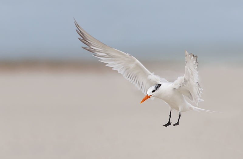
This image of a Royal Tern coming in for a landing was created at Fort DeSoto with the hand held Canon 500mm f/4L EF IS II lens, the Canon 1.4x EF tele-extender III, and the Canon EOS-1D X. ISO 800. Evaluative metering +2/3 stop off the sky: 1/2000 sec. at f/6.3 in Manual mode. Central sensor/Surround/AI Servo Rear Focus AF active at the moment of exposure. Click here if you missed the Rear Focus Tutorial. Click on the image for a larger version. |
A Great Morning at Desoto
This is another of the many wonderful images that I created on the morning of Sunday, September 16 at Fort Desoto Park just south of St. Petersburg, FL. For more on that wonderful day (including lots of great images and a 100% crop that will knock your socks off) click here and here.
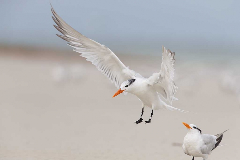
The image above was created from the original image below.
What Would You Do?
What changes did I make during post-processing? (Hint: there are at least six major ones.)
What would you have done?
Was what I did to the image wrong?
Would you have done anything else?
Which image do you like better, the original below or the master file above?
NYC Weekend Nature Photography Seminar
Presented by Denise Ippolito/A Creative Adventure and Arthur Morris/BIRDS AS ART
Hilton Garden Inn, Staten Island, New York. December 8-9, 2012 from 9am-4:30pm.
Weekend: $169. SAT or SUN: $99. Lodging available for out of town guests.
Saturday: Image Capture Sunday: Image Evaluation and Processing
Hilton Garden Inn, Staten Island, New York. December 8-9, 2012 from 9am-4:30pm.
Weekend: $169. SAT or SUN: $99. Lodging available for out of town guests.
Saturday: Image Capture Sunday: Image Evaluation and Processing
Click here for complete details including the Saturday and Sunday schedules, club and group discount info, and registration incentives and for more info on the In-the-Field Seminar Follow-up Workshop.
Artie, the grizzled veteran, is widely noted as one of the premier bird photographers, tour leaders, and educators on the planet. Denise, who specializes in flowers, is the mega-creative up-and-comer, a popular lecturer, a skilled field instructor, and an amazing Photoshop wizard who will share her tips and tricks with you. Both artie and denise are full time professional nature photographers.
BIRDS AS ART Instructional Photo-Tours
Click here for complete IPT information including the current schedule and links to general IPT info, deposit and cancellation policies. and the required registration and release forms.
Shop B&H


I’ll post then check other posts to see what I missed.
-horizon straightened
-all other birds taken out, including very OOF birds in background
-leg bands removed
-the dark shadow? by the lower bird taken out
-more black added maybe through more contrast?
-for better composition and to make up for the straightening, canvas added at top and left and right side and bottom cropped and maybe added some canvas to cover blank spots after the straightening tilt.
-water drop? taken off bill
-a little saturation added
What I would do differently-
-leave bottom right bird in even though his legs are cropped off. I feel it adds interest and most of all, shows relation of the ground and the landing bird. W/o the bird on the ground, I can’t get a sense where the landing bird is going to put down, or maybe its feet are already just touching. Then too, the bottom bird continues the nice diagonal line of the landing bird’s right wing.
– would probably do two images, one with bands off and one with bands on.
Thanks for your wonderful images and all your teaching.
Late to class … but with out looking I had
Horison corrected
Background out of focus birds removed
Lower bird removed and dark spot removed
Removed Bands
Lowered and moved subject to the right for composition
inproved color of horizon and sand.
I would not have removed the bands because I assist in banding however, as an artist I might have removed the bands, some thing a am conflicted. Making an image of the event and leaving it alone or enhanceing the event to tell a better story.
Thanks to your help, and my work with Digital Basics and your other books I can see the difference and may understand how it was accomplished. I an headed to B&H to make a small purchase…
Thanks again Artie….
Ed
So, in your past career were you teaching younger students? If so, did you assign those pictures asking them which one is different? This is a little harder. The answers were provided before I read the blog this morning (though I missed picking up on the increased sky).
I’m surprised you’re asking the “ethical” question, i.e., “was what I did wrong?” Since I’ve started reading your blog you’ve never apologized for the edits you made, and have always been upfront about doing it. It would be very different if you were trying to create an image based on something that never happened, such as placing the tern in a location where it was not found.
If I misunderstood the question, and you’re asking if what you did is artistically correct, that’s a subjective question that cannot be definitively answered. The edited image is pleasing, and better than the original. Would I have done it. No. But that’s only because my editing skills are not that good (small steps here). That said, I would have left the bands on the birds legs. If the tern watching the landing was not cut at the legs, I would have considered leaving it in the picture. Given the capture, it was best to remove it.
To be honest, the ‘new’ version seems almost too ‘perfect’ or almost generic. I like it slightly tighter with a few imperfections. Let it be said however, that the photography I see on this website is simply superlative and a huge inspiration.
Thanks Paul. I try to avoid the too-perfect look but in this case achieving it in camera is not at all an impossibility so I went with it.
Beautiful images as always and tons for us all to learn! Thanks.
Added Sky above
Added space to the left
Trimmed space from the right
Leveled Horizon
Removed OOF birds in the background
Removed clipped foreground bird
Removed leg bands
Cleaned up the bill
Compressed out color variations in sky, sand and
I think the whites in the bird too.
I like the processed image better.
Is the processed image too perfect? Too clean?
Leg bands may be an ethical issue. If this were a captive shot then I think they should stay because they represent a significant condition of the birds life. Since this is a free bird that was by chance included in a study I think it is fine to remove them.
I would have done exactly the same things! Yea, that’s it.
I would have cropped, removed other birds, removed one spot on the bill, and removed the leg bands. Not sure I would have leveled. I’m not sure the image wasn’t level. It could be a slight rise to the left (thus the vegetation) or just perspective from not being square to the horizon. I would have left the color variations alone because I’m not sure how you did that – sooo much to learn. I can imagine if you want to print the image the color gradients could be really mess up a larger print.
The 6 things are (not necessarily in the order given below):
1.Added more canvas on top
2.Moved the bird back a bit towards the right.
3.CCW rotation
4.Removed the small bird below
5.Removed the oof birds in the bg
6.Removed the black band to the left of the small bird.
The removal of the “sand blobs” was an important one for me.. It makes for a much cleaner image. Ditto on everything David said. Also maybe you lightened the center of the image with NIK. I might have left the lower Tern but cropped it from the mid-breast down, retaining the expression on it’s face. They do indeed have faces:)
I like what you did to it. Not sure about the leg bands.
Art, I have no problem with what you have done. My thoughts go this way – assume you were to paint or draw something that captured this same image – a painter/drawer starts with a blank canvas and adds his “images” to it (the things he wants to have in it) and ends up with a final picture (full canvas) that reflects his “interpretation” of what he has seen. You as a photographer, in fact, all of us as photographers, start with a full canvas and then we take our “electronic brush” (Photoshop) and remove the things we don’t want in the final image. One approach adds, the other subtracts – is there really any difference if the final result is what we wanted? That is my perspective on post-capture processing – I mean, unless it is something that has to be a piece of forensic evidence from a crime scene, if the final outcome is a good piece of art work – does it really matter how you arived at the final image.
October 31, 2012 at 12:20
Forgive me for saying this – I find the touched up version a tad boring – and ‘flat’…
I second David’s comments. The only downside of keeping the lower bird would be that its legs are cropped in the shot. On the other hand, that bird is not the main actor anyway. Good editing though.
Yikes! I didn’t even notice the leg bands!
1. Leveled the horizon
2. Got rid of the little bird behind and below the primary subject
3. Got rid of a small shadow just behind and to the left of the smaller bird
4. Eliminated background birds
5. Added canvas at the top and removed some on the right side to improve composition (I guess I could have said you moved the bird down and to the right)
6. Not sure, because it’s pretty faint on my monitor, but maybe a bit of sand cleanup in the bottom of the image under the primary subject
7. Some touchup of the primary subject using Nik
If you hadn’t cut off the smaller bird’s feet it would have been a great shot without #2. Either way, a great result!
Hey, Artie, welcome back–are you back?–and thanks for this. I can immediately see that you straightened the horizon, cleaned the background, removed the leg-bands on the flying tern, and removed the bird looking up at the flying tern. That’s 4 so I’ll look more for the other 2. You ask if anything was “wrong” and what we might have done, and I don’t know how to answer. Removing the leg bands changes an overall impression, which might be wrong, depending on your criteria and the criteria of a competition if you entered the image in one. I don’t think I’d have done that. Straightening the horizon and cleaning the background seems an unalloyed good and I would have done it. Removing the bird at the bottom right seems to me a matter of taste–you could argue that it’s matter of framing–and I’m not sure I would have done it because I like the way the bird is looking up at the flying one. In any case, both images reflect your skill and artistry; I can’t really pick a favorite, because I’d have done two things and probably not both of the other two.
Hi Artie, well you cropped top and RHS, you cleaned up some OOF in the sand, you removed the lower tern, you removed the rings on the legs, the horizon between the wings looks a little straighter and more pronounced. What did you do wrong – hey you didn’t take me!!
Artie, great shot.
– changes: delete background bird; delete legrings; bill cleanup; horizon leveled, white bkgd spot removal; lower bird in frame (or expand canvas).
– I would do most of those myself probably
– Nothing wrong to me, besides you are very open about it.
– nothing comes to mind; other than perhaps methodology used
– master file much more pleasing image
Thanks for sharing your knowledge. Have been following you for years and bought your books, site guides, and more which have made me a better photographer (but still a distance away from you). Furthermore, it allowed me to answer your questions above.
Happy shooting and greetings from Holland!
Wilfred
PS. Too bad the dutch IPT was filled so quickly. Have fun!
Thanks for your kind comments Wilfred. And for your purchases. We will almost surely repeat the Holland trip so keep your eyes peeled.