|
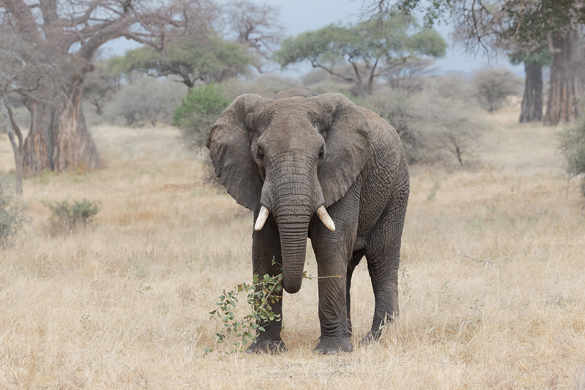
This image was created with the hand held Canon EF 70-200mm f/2.8L IS II USM lens (at 85mm) and the Canon EOS 5D Mark III. ISO 800. Evaluative metering +1 stop: 1/250 sec. at f/8. One sensor to the right and two rows up from the central sensor/AI Servo-Surround/Rear Focus AF as framed active at the moment of exposure. Click here if you missed the Rear Focus Tutorial. Click on the image to see a larger version. |
Large Grey Trio
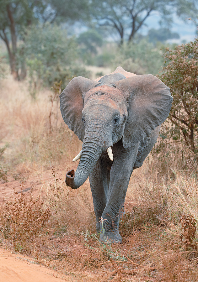
Here are three very different African Elephant images, each made on last August’s Summer Safari. Please leave a comment and let us know which is your favorite and why. What do you think of the framing of the first image? How do you feel about the centered composition with the second image? Would you change anything in the third image? What is the strength of the third image?
How would you have improved the first image? The second? Does anything in the third image bug you? If yes, what?

|
|
This image was created with the hand held Canon EF 200-400mm f/4L IS USM lens with Internal 1.4x Extender (at 239mm) and the and the Canon EOS-1D X. ISO 400. Evaluative metering +2/3 stop: 1/400 sec. at f/7.1. Central sensor/AI Servo-Surround/Rear Focus AF right between the tusks active at the moment of exposure. Click here if you missed the Rear Focus Tutorial. Click on the image to see a larger version. |
Best Parts
For you, what is the best thing about the first image? What do you like best about the second image?

|
|
This image was also created with the hand held Canon EF 200-400mm f/4L IS USM lens with Internal 1.4x Extender (at 225mm) and the and the Canon EOS-1D X. ISO 400. Evaluative metering +1/3 stop: 1/400 sec. at f/5.6. One sensor up from the central sensor/AI Servo-Surround/Rear Focus AF right between the tusks active at the moment of exposure. Click here if you missed the Rear Focus Tutorial. Click on the image to see a larger version. |

|
BIRDS AS ART 2nd International Bird Photography Competition
Learn more and enter the BIRDS AS ART 2nd International Bird Photography Competition here. Twenty-five great prizes including the $1000 Grand Prize and intense competition. Bring your best.
2014 Tanzania Summer Safari
If you are interested in joining us in Tanzania next summer please shoot me an e-mail and I will be glad to forward you the PDF with dates, itinerary, and price.
Support the BAA Blog. Support the BAA Bulletins: Shop B&H here!
We want and need to keep providing you with the latest free information, photography and Photoshop lessons, and all manner of related information. Show your appreciation by making your purchases immediately after clicking on any of our B&H or Amazon Affiliate links in this blog post. Remember, B&H ain’t just photography!


Amazon
Everyone buys something from Amazon, be it a big lens or deodorant. Support the blog by starting your search by starting your search by clicking on the logo-link below. No purchase is too small to be appreciated; they all add up. Why make it a habit? Because I make it a habit of bringing you new images and information on an almost daily basis.
Typos
In all Bulletins, feel free to e-mail or leave a comment regarding any typos, wrong words, misspellings, omissions, or grammatical errors. Just be right. 🙂
IPT Info
Many of our great trips are filling up. Two great leaders ensure that you will not learn more anywhere about how to make great images. Click here for the schedule and additional info.


I like the 1st photo , it has action the use of curves lead your eye through the scene . The second photo problem is 3 legged animal. The last shot road should have been cropped out and I would change my shooting prospective to eliminate that brown hump over it back.
Thanks for commenting. The view of the legs in #2 does not bother me at all. See my comments below on the various other issues.
I like the first two images, especially the first. I’m not troubled by the cropped ear in the first, nor the centered subject in the second. While the 3rd image is an accurate portrayal of the moving elephant, there are two things that seem to distract for me: 1) Not seeing a rear leg makes the elephant appear unbalanced, and 2) the light colored object (an anthill behind the elephant maybe, or the rear portion of the elephant with the spine sticking up…just can’t tell for sure) behind the elephant with the “bump” right over the critter’s head seems to me to distract from the elephant, as it draws attention from the head and nicel position of the front legs/feet, at least for me. These two things made the 3rd image less effective than the first two. My guess is that a capture either earlier or later in the sequence of the approaching animal would have resolved both of these distractions by showing a rear leg and having the light colored item in the background either covered by the elephant or at least not having the “bump” centered over the head. And yes, I’d like it better without the bare ground or road in the foreground.
I see your point on the missing leg :). Thanks for commenting. I am not sure if the “termite mound” is or is not the elephant’s back with red dust on it…
The first image is my favorite, great composition, great detail, great story. Some images for what ever reason, have an instant impact on me when I first view them. Your first image is one such image!!
Agree!
I prefer the first image.There is a sense of motion and action in the curled trunk as the elephant pulls the shrub.The cropping is fine and I like the fact that the eye is very visible which creates a sense of connection.
I find the second shot to be a little static although the elephant does look like it is sizing you up.Little tighter crop moving the elephant out of the center might work but keep some of the sky in the background as the blue/gray shy goes well with the subject.
In the third image the ears and trunk are up which is nice and the elephant is walking.For a shot at this distance it would be nice to see some of the body of the elephant but he obviously wasn’t going to take directions at this point.
Roadway detracts from the shot and is very noticeable.
Have a great day Artie
Thanks for commenting. See my comments on the road below :).
The first shot is wonderful!!!! The color is great and presents a great story!!!
Thanks for commenting Mark W.
I like the first image, in part, because it hints at a story of strength. The second image could be cropped a bit, more importantly, I would get rid of the branch he’s/she is holding, then you would have an image of danger. That branch lessens the threat. Get rid of the road in the corner of the third photo. I like the color from the dust bath, the sharpness and the subject is not static but walking toward you. All that said, I would trade in my d300 to have been there.
Thank you for all the teaching you have and continue to do. Even an old geezer shooting Nikon has learned a ton from you and Denise.
Hi Raleigh. Thanks for commenting and for you kind words. With #2, the branch tells the whole story. Cropping the road is not an option as the elephant would not have enough room. It would be possible to eliminate it with some fancy work but it does not really bug me.
Do consider joining Todd and me in Tanzania next summer. 🙂
The first one is my favorite. The ear looks fine to me—looks as if framed, not clipped. I like the colors, the closeup of a behavior, and feels like there is just the right amount of space in front the face. I’m right there with the elephant (see third one)
I like the second one too. Because the elephant is looking straight ahead it balances. If the elephant were on the right side of the frame, it would need to be looking left for good balance. The trees in back frame it well. The branch makes the photo. Without it, it would be a ho hum image.
Third one–I wish the bit of road weren’t there, it draws attention from the animal. Cropping would just barely miss the toenails which would not be so good. The strong color of the bush behind the animal is a bit distracting. And the camera is looking down when I like being on equal height with a subject. Angled down diminishes the size of this animal. However, I realize that this guy was just next to your vehicle so the only way was to angle down. The pose of the front legs is elegant.
Agree on #1. And #2. On #3, there is no way to crop out the road. And the color of the bush does not bother me at all. Making the image from an opened van window might have been a good option depending on how much sky was introduced.
Thanks for commenting.
Art,
I prefer the 2nd one, even with the main subject centered. The baobabs are a nice frame, and the branch in the trunk adds interest and some off center tension. On the first, while the activity is captivating, the clipped ear is a bit unfortunate, yet the framing is great. On the third image the roadway in the foreground (lower left) speaks to a man made intrusion into nature (necessary for vehicle access, but distracts from the environment.)
Hi Marr, Thanks for commenting. At first I was unhappy with the clipped ear but in retrospect, had I gotten the whole ear in that would have left a lot of white sky upper right to distract the viewer. As for the road, a road is a road is a road.