Stuff
I am currently leading the 2015 Bear Catching Salmon Bear Boat IPT. I will be back very soon.
|
This image was created on our day off between the two 2015 Palouse IPTs with the hand held Canon EF 24-105mm f/4L IS USM lens (at 55mm) and the here to see the latest version of the Rear Focus Tutorial. Click on the image to see a larger version. |
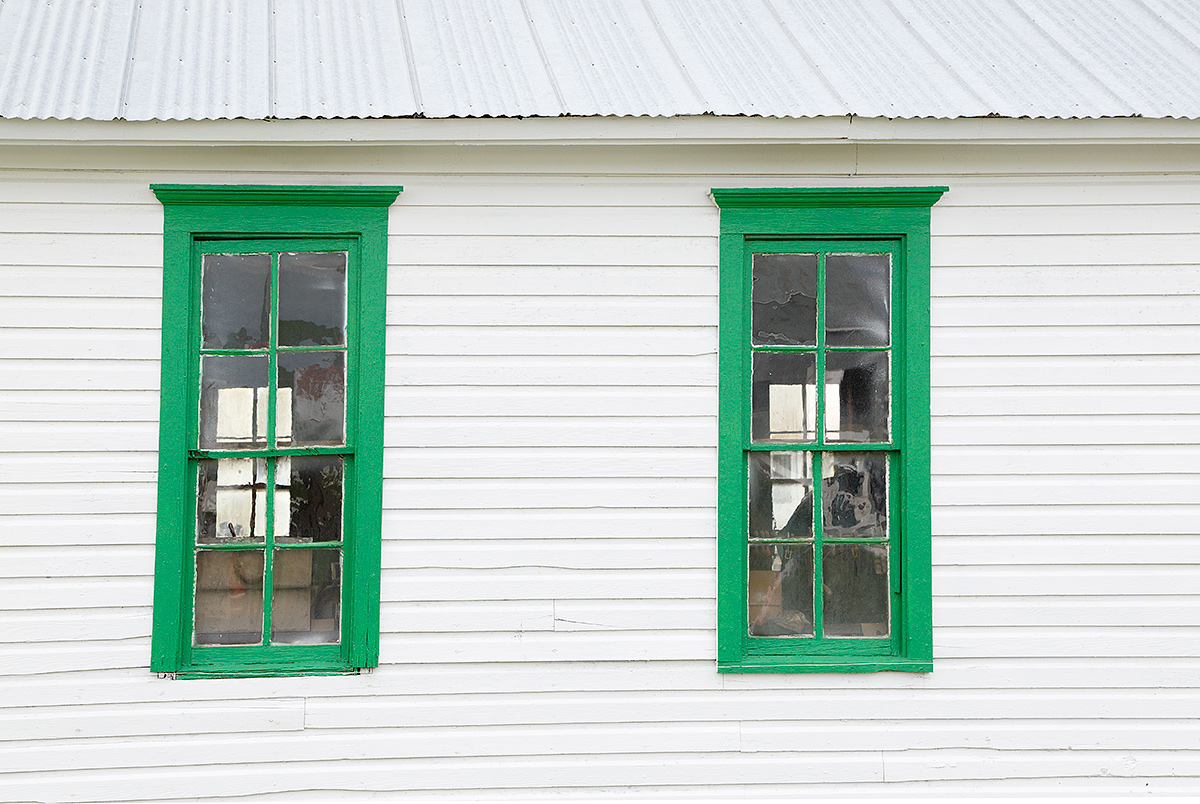
Old White Schoolhouse with Green Trim
This small white building caught my eye in the soft light. Two farmers drove up in their truck while I was photographing it. We started chatting. I learned that the father of one of them had gone to school in the building. He had it moved from 20 miles away to its present location on his property when he learned that it was scheduled to be demolished.
Worth a Damn or Not?
Do you like this image or do you find it boring? If the latter, is there anything that you like about it? What could I have done to improve this image? Would you have created it or something similar? Would you have made a different image of the same subject? Please be frank and be sure to let us know why you feel the way that you do.
Exposure Error
I should have known better. This image was about one full stop underexposed. Where did I go wrong? Be sure to mention the quality of the light and the overall tonality in your answer.
|
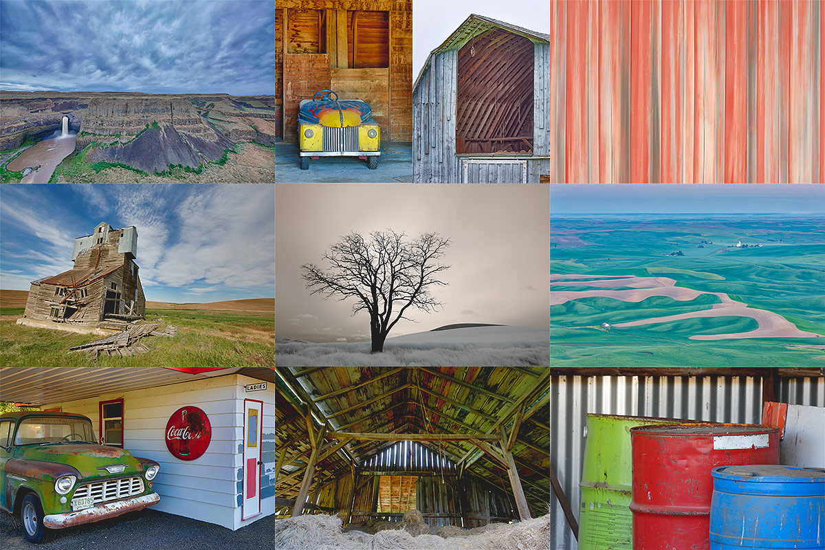
Subject and focal lengths from upper left to right and then around to center. Palouse Falls: 11mm; homemade kiddie race car: 105mm; barn siding pan blur: 798mm; Rolling fields diorama: 110mm; Crayola drums: 343 mm; Hay barn interior: 19mm; vintage gas station: 40mm; Dilapidated farm building: 13mm; Denise’s tree Infrared: 20mm. Images and card design by Arthur Morris/BIRDS AS ART. |
The Palouse ~ A Creative Adventure/BIRDS AS ART Instructional Photo-Tour (IPT)/Eastern Washington State. June 3-7, 2016/5 Full Days: $1699/Limit 12
The Palouse ~ A Creative Adventure/BIRDS AS ART Instructional Photo-Tour (IPT)/Eastern Washington State. June 10-14, 2016/5 Full Days: $1699/Limit 12
Double Header!
Maximize both your travel dollars and your learning experience by signing up for both IPTs.
|
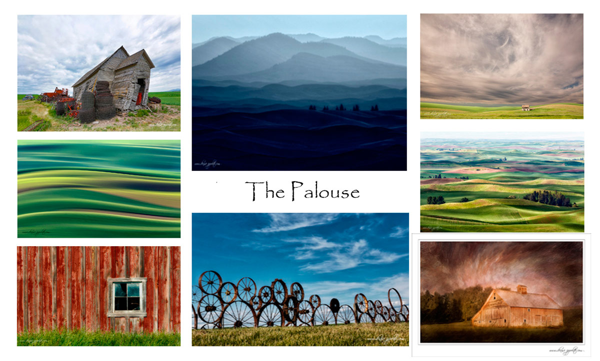
Images and card design by Denise Ippolito/A Creative Adventure. |
The Palouse IPTs
Rolling farmlands provide a magical patchwork of textures and colors, especially when viewed from the top of Steptoe Butte where we will likely enjoy spectacular sunrises and possibly a nice sunset. We will photograph grand landscapes and mini-scenics of the rolling hills and farm fields. We will take you to some really neat old abandoned barns and farmhouses in idyllic settings. There is no better way to improve your compositional and image design skills and to develop your creativity than to join us for this trip. Two great leaders: Denise Ippolito and Arthur Morris. Photoshop and image sharing sessions when we have the time and energy…. We get up early and stay out late and the days are long.
After 6 days of back-breaking scouting work in early June 2014 we found all of the iconic locations and, in addition, lots of spectacular new old barns and breath-taking landforms and views. On three additional scouting days in 2015 we discovered several more truly amazing locations. We will teach you what makes one situation prime and another seemingly similar one a waste of your time.
What’s included: In-the-field instruction, guidance, lessons, and inspiration, our newfound but very extensive knowledge of the area, all lunches, motel lobby grab and go breakfasts, and Photoshop and image sharing sessions when possible. There will be a meet and greet at 7:30pm on the evening before each workshop begins.
You will learn and hone both basic and advanced compositional and image design skills. You will learn to get the right exposure every time. You will learn to develop your creative eye. You will learn the basics of HDR (high dynamic range) photography. You will learn a variety of in-camera creative techniques. Most importantly you will learn to see the situation and to create a variety of top-notch images. Do see both of our blogs for lots more on that in the coming weeks. You will learn how the quality and direction of light combine to determine the success of your images. And–please don’t gasp–we will be working quite a bit with sidelight when creating landscapes. Lastly, we will be doing some infrared photography.
To Sign Up
A non-refundable $699 deposit is due now. The balance will be due on February 15, 2016. If we do not receive your check for the balance on or before the due date we will try to fill your spot from the waiting list. Whether or not your spot is filled, you will lose your deposit. If not, you can secure your spot by paying your balance.
With the spectacular success that we enjoyed in 2015 it seems quite likely that this one will fill up very quickly. Please let me know via e-mail that you will be joining us. Then you can either call Jim or Jennifer at 863-692-0906 during business hours or send us a check to leave a deposit; the latter is preferred. If by check, please make out to “Arthur Morris” and mail it to: Arthur Morris/BIRDS AS ART, PO Box 7245, Indian Lake Estates, FL, 33855. If you have any questions, please feel free to contact us via e-mail: artie or denise.
Travel Insurance Services offers a variety of plans and options. Included with the Elite Option or available as an upgrade to the Basic & Plus Options. You can also purchase Cancel for Any Reason Coverage that expands the list of reasons for your canceling to include things such as sudden work or family obligation and even a simple change of mind. You can learn more here: Travel Insurance Services. Do note that many plans require that you purchase your travel insurance within 14 days of our cashing your deposit check. Whenever purchasing travel insurance be sure to read the fine print carefully even when dealing with reputable firms like TSI.
Be sure to like and follow BAA on Facebook by clicking on the logo link upper right. Tanks a stack!
Support the BAA Blog. Support the BAA Bulletins: Shop B&H here!
We want and need to keep providing you with the latest free information, photography and Photoshop lessons, and all manner of related information. Show your appreciation by making your purchases immediately after clicking on any of our B&H or Amazon Affiliate links in this blog post. Remember, B&H ain’t just photography!
Amazon.com
Those who prefer to support BAA by shopping with Amazon may use this link:
Amazon Canada
Many kind folks from north of the border, eh, have e-mailed stating that they would love to help us out by using one of our affiliate links but that living in Canada and doing so presents numerous problems. Now, they can help us out by using our Amazon Canada affiliate link by starting their searches by clicking here. Many thanks to those who have written.
Typos
In all blog posts and Bulletins, feel free to e-mail or to leave a comment regarding any typos or errors. Just be right :).


Does anyone else see what looks like reflections of large eyes in the upper right of both windows?
I like images like this that you have to really look at for a second to get “drawn in.” I know a really great image just captures a viewers attention, but images like this seam to make you think a little and look for things.
Hi Artie,
Many folks including me may not give this image as much as a second glance.
But when I stay and look at it for a while I get to consider the composition, quality and direction of the light ,
The lines and angles in the image and what it is that hold one in the frame.
This image could be very instructive.
Much could be made of the way the lines work or don’t work.
The solid blocks of colour and the flat lighting all have pros and cons.
I notice you have carefully made the gutter line parallel with the frame line at the top.
But this is a building and we expect to see straight boards, so,for me nearly straight boards is a miss.
The roof has slope and angles so my eye is more accepting of an out of parallel line at the top.
The intriguing thing is that on the face of it , this is a very plain image.
But there are a number of very clever subtleties here that need exploring.
The image has great structure. Simple blocks of colour and plain lighting so the the lines and the colours take on greater significance.
What have I learned here?
‘Take another look’
Regards
David.
David, Thanks for your thoughtful comments. artie
I like the right window enlarged Into a vertical image. Otherwise it doesn’t inspire me. I especially don’t like the roof. It looks new. And I don’t see much of interest in the white siding.
Thanks ar. a
I like the color contrasts but the left window looks a little distorted. Maybe that’s just the way it is.
I think there would be more interest if a person were included inside, at a window, underexposed, sort of ghostly. The best photos are those that pose questions – who is that person, what is he doing there, why can’t we see him more clearly, is he looking at us, are we welcome?
Hi, Artie, and thanks as always. Answers.
A. Do you like this image or do you find it boring?
a. I like a little, but I don’t find it particularly interesting. I like Henry’s comments but that’s more work than I want to do on someone else’s image.
B. If the latter, is there anything that you like about it?
b. Oh, yes, indeed; I like the vertically oriented green frames against the horizontal wood boards, and I like the roof.
C. What could I have done to improve this image? Would you have created it or something similar?
c. I can’t answer either of these questions well without seeing more of the whole scene. What was the context? What was on either side of, above, and in front of the building? Would a wider-angle focal length have given a more pleasing image? Having said that, I would have tried a tighter crop, perhaps in landscape orientation, of one of the windows.
D. Would you have made a different image of the same subject?
d. Guaranteed! We all have our own way of looking at and seeing things, and so I’m sure I’d have done something different! Other than the tighter crop of one frame suggested above, though, I can’t know what I’d have done without seeing more.
E. Please be frank and be sure to let us know why you feel the way that you do.
e. Best I can do.
Typo: In my answer c, I meant to say “portrait orientation.”
Hi Artie,
Interesting image, the more I looked at it the more fascinating the striking difference between the green frames and the white building. Seeing the inside through the windows adds a little mystery to the photo and another element to attract and hold the viewers eye…started to wonder what all those objects were and what their story was. Seeing the inside adds an element to the photo that also keeps your eyes on the green framed windows. I think without seeing the inside the photo would be…well…just a photo of green framed windows on a white building. I was wondering though…what would you think about cropping the photo at the top so that there was less roof showing (perhaps just a little above the corrugated metal roof), and cropping a little of the building out at the bottom. This, I think, would bring the viewers eye more to the green framed windows and the white siding, as well as those mysterious objects seen through the window.
Artie Having benefitted from your sage critiques of my bird photos it is a pleasure to comment on your picture. My view is that the major problem is the subject itself, kinda boring, and the light which looks flat. A broken window pane, some soft late afternoon light and perhaps an angled shot rather than straight on might have made a more interesting picture. Not sure exactly what is inside the window but might a close up of a single window and interesting contents been useful? Bob
I agree on pretty boring but I found the whole thing and meeting the farmers to be quaint. a
Its a little boring for me. The part I dislike the most is seeing the contents from inside.
Maybe a different angle would’ve darkened the windows a little. Or maybe have the farmer pose from the inside, while adding a sepia tone type of effect in post. The next part I don’t like is the roof. With the color of the house, its just to white for me. I think if the roof was more rustic would’ve helped. Finally, for something that was going be demolished, it looks to be in pretty good shape. So I’m guessing he restored it a little, making it look too ‘new’ for me. I do like seeing the windows from the other side, they kind of act like pupils.
Doug
Thanks Doug, I liked being able to see inside 🙂 a