What’s Up?
On Day 4 of the first Palouse IPT we had a great morning exploring a variety of situations. Images soon.
The Streak
Today’s blog post marks a totally ridiculous 214 days in a row with a new educational (and fun) blog post. And I still have dozens of new topics to cover; there should be no end in sight until my big South America trip next fall. As always-–and folks have been doing a really great job recently–-please remember to use our B&H links for your major gear purchases. For best results use one of our many product-specific links; after clicking on one of those you can continue shopping with all subsequent purchases invisibly tracked to BAA. Your doing so is always greatly appreciated. Please remember: web orders only. Please remember that if you are shopping for items that we carry in the BAA Online Store (as noted in red at the close of this post below) we would appreciate your business.
|
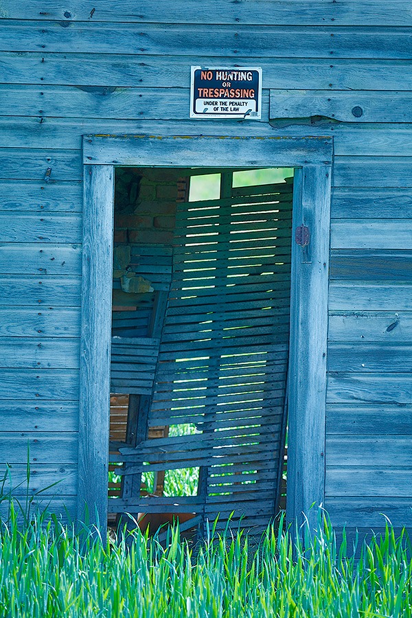
This in-camera HDR Art Vivid image was also created on Wednesday afternoon south of Spokane, WA with the Induro GIT 304L/Mongoose M3.6-mounted Canon EF 200-400mm f/4L IS USM Lens with Internal 1.4x Extender (at 388mm) and the mega mega-pixel Canon EOS 5DS R. ISO 400. Evaluative metering +/-3 stops around a base exposure of +1 stop: 1/25 sec. at f/13. WB = K4000. Live View with 2-second timer. Image #1: Old farmhouse door with blue color cast |
A Funny Story about the Horrific, Abominable Blue Door…
In the “A Contrast in Styles” blog post here, many folks commented about the blue color cast on the featured image. As a side note, many folks, out of habit I guess, picked a favorite even though the question of the day was “Which image is closer to your vision?” More folks liked Denise’s infrared image than liked my blue door image. I was and am fine with that.
Here are some of the comments on my horrific image:
Art, your image does nothing for me and is too blue for my tastes.
Unfortunately, the closeup just looks “wrong” to me and I find myself wanting to move on quickly.
Your image is striking, for me, it’s oversaturated in blue. There’s even a ton of blue in the grass.
Do understand that any object photographed in shade will naturally have a blue color cast…
Here is the funny story: when I processed the tight image of the doorway, I created a blue version and a gray version and shared them both with Denise Ippolito. She said, The image has a heavy cyan cast, but it has a fun look and if you are going for something creative, it’s fine, but you should reduce the blue a bit.” I did; the resulting image is the one that was posted in the original blog post and above.
In short, I liked it as originally posted.
|
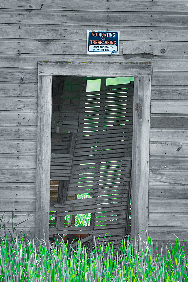
This in-camera HDR Art Vivid image was also created on Wednesday afternoon south of Spokane, WA with the Induro GIT 304L/Mongoose M3.6-mounted Canon EF 200-400mm f/4L IS USM Lens with Internal 1.4x Extender (at 388mm) and the mega mega-pixel Canon EOS 5DS R. ISO 400. Evaluative metering +/-3 stops around a base exposure of +1 stop: 1/25 sec. at f/13. WB = K4000. Live View with 2-second timer. Image #2: Old farmhouse door, gray version. Image copyright 2016: Arthur Morris/BIRDS AS ART |
Photoshop Lesson: Getting the Gray Out
To remove the blue color cast I first created a duplicate layer. Then I hit Control + U to open Hue-Saturation adjustment on a layer. Then I selected the blue channel from the drop-down menu, moved the Saturation slider to the left to -80 (or to your taste), and moved the Lightness slider to the right to +10 (or to your taste). But the image still looked off. What to do? Select the cyan slider from the dropdown menu and repeat as above to your taste.
Then I added a Regular Layer mask and painted the color back in on the small sign.
|
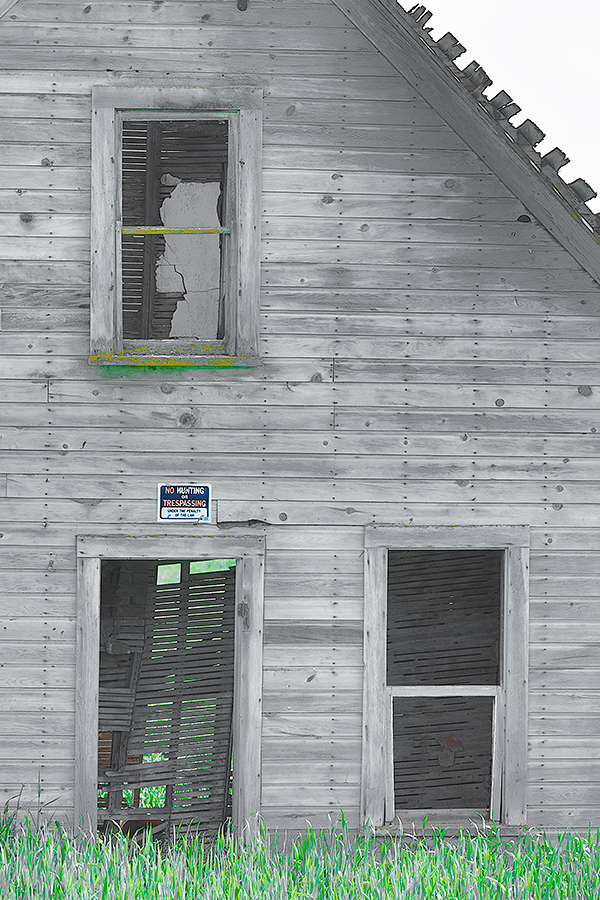
This in-camera HDR Art Vivid image was also created on Wednesday afternoon south of Spokane, WA with the Induro GIT 304L/Mongoose M3.6-mounted Canon EF 200-400mm f/4L IS USM Lens with Internal 1.4x Extender (at 200mm) and the mega mega-pixel Canon EOS 5DS R. ISO 400. Evaluative metering +/-3 stops around a base exposure of +2 stops: 1/50 sec. at f/11. WB = K4000. Live View with 2-second timer. Image #3: Wider view of the front of the old farmhouse |
An Alternate Image Design–the gray version by popular demand..
The 200-400 with Internal Extender has probably been my most used lens through 3 1/3 days of the first Palouse IPT. It is superb for creating images of Steptoe Butte’s rolling farmlands and of close-up details of relatively distant farmhouses and barns. I can go from 200mm to 784mm in a matter of seconds simply by engaging the internal TC and adding an external one.
Let’s Try This…
Please leave a comment and let us know which of the three images here is your favorite, and why.
Please Remember to use our Affiliate Links and to Visit the New BAA Online Store 🙂
To show your appreciation for my continuing efforts here, we ask, as always, that you get in the habit of using my B&H affiliate links on the right side of the blog for all of your photo and electronics purchases. Please check the availability of all photographic accessories in the New BIRDS AS ART Online Store, especially the Mongoose M3.6 tripod head, Wimberley lens plates, Delkin flash cards and accessories, and LensCoat stuff.
As always, we sell only what I have used, have tested, and can depend on. We will not sell you junk. We know what you need to make creating great images easy and fun. And we are always glad to answer your gear questions via e-mail.
I would of course appreciate your using our B&H affiliate links for all of your major gear, video, and electronic purchases. For the photographic stuff mentioned in the paragraph above we, and for everything else in the new store, we, meaning BAA, would of course greatly appreciate your business. Here is a huge thank you to the many who have been using our links on a regular basis and those who will be visiting the New BIRDS AS ART Online Store as well.
Be sure to like and follow BAA on Facebook by clicking on the logo link upper right. Tanks a stack!
Typos
In all blog posts and Bulletins, feel free to e-mail or to leave a comment regarding any typos or errors. Just be right 🙂





I’m going to vote for the blue one. I like colourful images & the grey looks unnatural.
Artie, I don’t have a favorite…each of them are growing on me…I’m amazed at how many nails they used on the clapboards…did you try the cyan on #3?
J
#s 2 and 3 were processed pretty much the same way. a
Something must be wrong with me. I’ve been
a graphic artist for 43 years. I don’t use hard and fast rules.
I LOVE YOUR ORIGINAL BLUE CAST IMAGE the way you first
posted it.
You can be nice, but don’t let people mess up your own vision.
God Bless You,
Ray
I like #3, the wider view with the triangle of white sky at the top right. I think having that bit of blank space above the diagonal of the roof helps the composition a bit. You also get those little bits of yellow and green (paint?) on the windowsill that break up the gray wall.
Hey Jake,
Thanks for your thoughtful comments.
artie
I prefer the third image. I think the overall image is more pleasing to my eye. I don’t think it is too busy as I see it as a small slice of the big picture of the old barn. I think the pops of green in the grass and below the window frame add to the image. Great job!
Images 1 & 2 are less appealing because the No Trespassing sign dominates the image for me and draws my eye to it. I like the gray image better than the blue one because it does look more natural.
Roger D
Hey Roger,
Thanks for your thoughtful comments.
artie
I will vote for number 4, which is #2 with a complete mono conversion. 🙂 Why? The color in the sign and grass look like they were added artificially to a B&W image, and as noted by others #3 looks cluttered with no real focal point.
Art, my vote would go for #2. The first one is too blue for me and the third one is too cluttered in the sense that there are too many features trying to grab my attention – the door, two windows, the roof edge, etc. Where I live, there are a lot of old, dilapidated farm buildings from times gone by and I am more used to seeing the “grey” coloured, weathered wood than I am any other colour, so I suspect that this has something to do with my choice. We tend to favour things which look like things we are familiar with.
I also agree with the comment by Jack Goodman that this would an interesting image in black and white, but not necessarily IR.
Hi! I originally really liked the blue, yet I’m new to the site and peer pressure caused me not to say anything! haha;) For me the original blue is artistic, creative, intriguing, and made me stop and take notice-especially at all the details and elements in the photo. I do like the gray version, yet for me it was not as much of a wow, so I did not stop and investigate the details as much. When I did go back and take time to look at the gray image, I really love the details and colors of the grey tones in the wood.
Loving this blog!! Appreciate all your sharing!
Thanks Christy. Glad to see you here. Next time speak your mind; I have been doing it that way for about five decades and though some folks don’t like it this approach has worked very well for me 🙂 later and love, a
Why K4000?
Too tone down the rich colors of the Art Vivid in-camera JPEGs, especially the YELLOWs and GREENs.
a
This image might look more dramatic in black and white, with some touch up from Silver Effects Pro.
Jack
My favorite is number 3. It has a lot going on that I love…
1. The single window on top and the two on the bottom.
2. The horizontal lines of the windows and building.
3. The diagonal line of the roof and the horizontals of the window frames.
4. Not sure if they’re tiles, but I like how they stick out from the roof.
5. Also like the nails.
6. Then there’s the green grass as a border.
7. Not sure what it is, but the bottom of the top window, that green/yellow
color, I think that goes great with the b&w.
If I had to pick between #1 and #2 only…I’d pick #2. I just think the green
grass goes more with the b&w and stands out vs the blue.
Doug