What’s Up?
I swam my slow 3/4 mile on Sunday morning at 11am and then headed into the city to see Jersey Boys on Broadway for the third time in 8 months and the second time in 8 days. I will share the whole story tomorrow…
The Streak
Today’s blog post marks a totally insane, irrational, illogical, preposterous, absurd, completely ridiculous, unfathomable, silly, incomprehensible, what’s wrong with this guy?, makes-no-sense, 277 days in a row with a new educational blog post. There should be no end in sight until my big South America trip next fall. As always-–and folks have been doing a really great job recently–-please remember to use our B&H links for your major gear purchases. For best results use one of our many product-specific links; after clicking on one of those you can continue shopping with all subsequent purchases invisibly tracked to BAA. Your doing so is always greatly appreciated. Please remember: web orders only. AND Please remember also that if you are shopping for items that we carry in the new BAA Online Store (as noted in red at the close of this post below) we would appreciate your business.
|
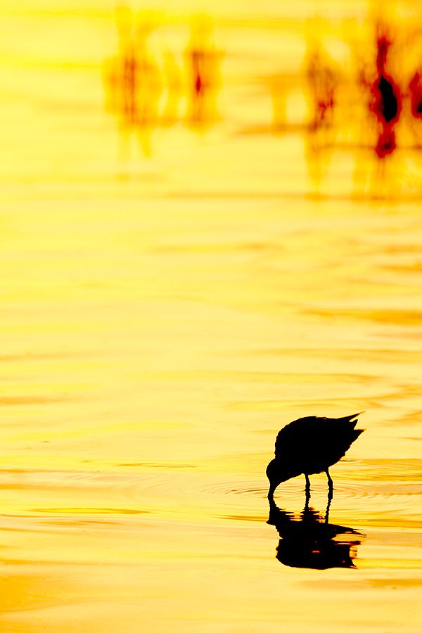
This image was created at Fort DeSoto with the Induro GIT 304L/Mongoose M3.6-mounted Canon EF 600mm f/4L IS II USM lens and the Canon EOS-1D X Mark II with 64GB Card and Reader. ISO 400. Evaluative metering +1 2/3 stops: 1/160 sec. at f9 in Av mode. WB: K8000. (I have no idea why I was at f/9; should have been at least f/5.6 for a faster shutter speed to better freeze the feeding shorebird…) Center AF point/AI Servo Surround/Rear Focus AF and re-compose. Click here to see the latest version of the Rear Focus Tutorial. Click on the image to see a larger version. Image #1: Short-billed Dowitcher feeding at sunrise |
An Important Vertical Image Design Principle
With a long, tall subject in a vertical frame it is generally fine to center the subject, usually with a bit more room above the subject than below. With small subjects in vertical frames it is vitally important to place the subject in a corner of the frame; dead-centering a small-in-the-frame subject when working in vertical format is generally an image killer. These types of images generally work best if there is some nice habitat or gorgeous color to finish off the motif. (The late, great German nature photographer Fritz Poilking loved to use that word for “composition” or “image design.”
An Image Question
If this image were yours, would you eliminate the four small red areas in the reflection of the silhouette and the single red blip on the bird’s lower back? Why or why not? Remember, the more folks participate the more everyone learns, including me.
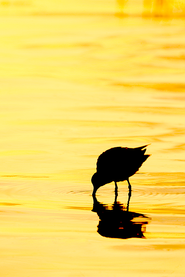
Image #2: this is a 2X3 cropped version of the image above |
Tight or Wide?
Which image do you like better, #1 or #2? Whichever one is your favorite, please be sure to let us know why. And don’t be lazy: by keeping the blog interactive everybody learns more–including me…
|
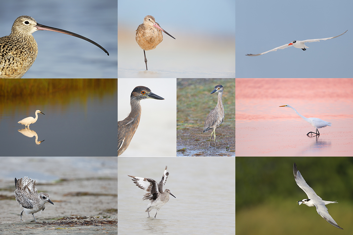
Fort DeSoto in fall is rife with tame birds. All of the images in this card were created at Fort DeSoto in either late September or early October. I hope that you can join me there this fall one way or another. Click on the composite to enjoy a larger version. |
BIRDS AS ART Fort DeSoto In-the-Field Meet-up Workshop (ITFW): $99
Join me on the morning of October 2, 2016 for 3-hours of photographic instruction at Fort DeSoto Park. Beginners are welcome. Lenses of 300mm or longer are recommended but even those with 70-200s should get to make some nice images. Teleconverters are always a plus.
You will learn the basics of digital exposure and image design, autofocus basics, and how to get close to free and wild birds. We should get to photograph a variety of wading birds, shorebirds, terns, and gulls. This inexpensive morning workshop is designed to give folks a taste of the level and the quality of instruction that is provided on BIRDS AS ART Instructional Photo-tours. I hope to meet you there.
To register please call Jim or Jennifer during weekday business hours with a credit card in hand to pay the nominal registration fee. Your registration fee is non-refundable. You will receive a short e-mail with instructions, gear advice, and meeting place one week before the event.
|
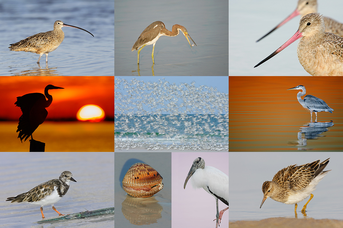
Folks attending the IPT will be in the field early and stay out late to take advantage of sunrise and sunset colors. The good news is that the days are relatively short in early fall. Click on the composite to enjoy a larger version. |
Fort DeSoto Short Notice Fall IPT/September 28 (meet & greet and afternoon session) through the full day on October 1, 2016. 3 1/2 DAYs: $1549. Limit 10/Openings: 8. Sunday morning ITFW free to IPT registrants.
Fort DeSoto, located just south of St. Petersburg, FL, is a mecca for migrant shorebirds in fall. There they join dozens of egrets, herons, night-herons, gulls, and terns who winter on the T-shaped peninsula that serves as their wintering grounds. With any luck, we should get to photograph two of Florida’s most desirable shorebird species: Marbled Godwit and the spectacular Long-billed Curlew. Black-bellied Plover and Willet are easy, American Oystercatcher likely. Great Egret, Snowy Egret, Great Blue Heron, and Tricolored Heron are easy as well and we will almost surely come up with a tame Yellow-crowned Night-Heron or two. We should get to do some Brown Pelican flight photography. And Royal, Sandwich, Forster’s, and Caspian Terns will likely provide us with some good flight opportunities as well. Though not guaranteed, Roseate Spoonbill and Wood Stork would not be unexpected.
Folks who sign up for the IPT are welcome to join me as my guest on the ITFW on the Sunday morning following the workshop. See above for details on that.
On this and all other IPTs you will learn basics and fine points of digital exposure and to get the right exposure every time after making a single test exposure, how to approach free and wild birds without disturbing them, to understand and predict bird behavior, to identify and age many species of shorebirds, to spot the good situations, to choose the best perspective, to see and understand the light, to, and to design pleasing images by mastering your camera’s AF system. And you will learn learn how and why to work in Manual mode (even if you’re scared of it).
At brunch (included) we will review my images–folks learn a ton watching me edit–why keep this one and delete that one. If you opt to bring your laptop, we can take a look at a few of your images from the morning session. We will process a few of my images in Photoshop after converting them in DPP. That followed by Instructor Nap Time.
As I already have one signed up for this workshop, it is a go. Hotel info will be e-mailed when you register. The best airport is Tampa (TPA). It is always best if IPT folks stay in the same hotel so if you are interested it would be a good idea to register now and make your hotel reservations as soon as you hear from us. We can, however, coordinate with local folks who opt to stay at home.
Because of the relatively late date, payment is full is due upon registration either by check or credit card. If the former, please e-mail us immediately so that we can save you a spot. If the latter, please call Jim or Jennifer during weekday business hours at 863-692-0906 with a credit card in hand to register. Your registration fee is non-refundable unless the IPT sells out with eight so please check your plans carefully before committing. You will receive a confirmation e-mail with detailed instructions and gear & clothing advice a fairly soon.
Please Remember to use my Affiliate Links and to Visit the New BAA Online Store 🙂
To show your appreciation for my continuing efforts here, we ask, as always, that you get in the habit of using my B&H affiliate links on the right side of the blog for all of your photo and electronics purchases. Please check the availability of all photographic accessories in the New BIRDS AS ART Online Store, especially the Mongoose M3.6 tripod head, Wimberley lens plates, Delkin flash cards and accessories, and LensCoat stuff.
As always, we sell only what I have used, have tested, and can depend on. We will not sell you junk. We know what you need to make creating great images easy and fun. And we are always glad to answer your gear questions via e-mail.
I would of course appreciate your using our B&H affiliate links for all of your major gear, video, and electronic purchases. For the photographic stuff mentioned in the paragraph above we, and for everything else in the new store, we, meaning BAA, would of course greatly appreciate your business. Here is a huge thank you to the many who have been using our links on a regular basis and those who will be visiting the New BIRDS AS ART Online Store as well.
Be sure to like and follow BAA on Facebook by clicking on the logo link upper right. Tanks a stack!
Typos
In all blog posts and Bulletins, feel free to e-mail or to leave a comment regarding any typos or errors. Just be right 🙂









I prefer #1 as it gives a sense of place and makes your eyes alternate between the top and bottom (main subject) of the image “filling the frame”.
It reminds me of Robert Capa’s compositions. The #1 is more intriguing the #2 more relaxing.
Welcome Fabio. And thanks for your erudite comments.
a
ps: where are you from?
Hi Artie,
I prefer the tighter crop .It has less distracting elements and I like the circles rippling in the water around the legs and bill.The four red blips don’t bother me at all.
david.
Thanks for the lesson, Artie. I prefer image 1 for composition, or motif. If the bird were the subject, then #2. But for me the setting and the bird are subjects and in better balance in image one. Leave the red as it is. I thought of removing it, and then it occurred to me, “What would be served? What would be improved?” And I came up with no answers. Best.
I prefer #1 over #2. In my opinion silhouettes work best when conveying a sense of place and time. One does that better than two. Image #1 would be a rather pleasing image on its own without the bird. . The base scene is enhanced by the addition of the silhouette. The image flows. The horizontal rust reflections tie the upper and lower parts of the image together. One’s eye is able to follow the arcing band of reflections along the right side of the image. With image #2, the silhouette becomes the focal point with a background of beautiful water. The image is pleasing: however, one soon moves on from the featureless black bird and it’s reflection. Remove the red in the reflection.
I think I’d go with the second shot. I would likely crop out the line at the top just to keep my eye from going there. I also would crop out the red in the shadow. At the smaller size it is not a detraction to me, but when I blew it up a bit on the screen, it bothered me more. Not sure it would be a deal-breaker, but those of us who did not know it was ever there will not be asking where it went or why. I do like the gold light. I’ll have to try changing my color temps to pull more gold out of the early AM lighting. Great shot.
Should have read “…touch out the red…” in the second line.
I prefer the first image, the grasses provide balance and a sense of the environment. I think that the second is nice, but doesn’t hold the eye. The reflection doesn’t bother me, I would most likely leave it, but if it were removed I don’t think I would miss it either.
Image #1 is my preference. The shadowy grasses (?) at the top provides balance to the image and additional interest. While image #2 is by no means awful, I think #1 would be nicer for longer. But that’s just another uneducated Internet opinion…
I prefer #2 although if it were my image I would crop it slightly further from both the top and right side. I would pull the top right corner down until the area where the right leg meets the water is close to an ROT point.
Image No.2 is my favorite. I like the crop and composition and would keep the red. The red breaks up the reflection and adds depth, plus there is a hint of red on the outline of the bird. Very nice color in the water.
Second image first one to me the red areas are distracting like the second one my eye goes right to the bird
Hi Artie,
If it were my image, i’d leave the red spots in the reflection and bird’s back in the first image – i do not think they detract from the photo, and i find they add to the depth.
However, in the second (crop) photo, i would remove them. I love the balance in this crop, and would prefer the bird to remain pure silhouette without the distraction of the red spots (they sort of jumped out at me when i looked at the photo before reading the blog). I prefer to see the composition as a whole without the distraction of the detail.
Lovely photo either way, but leaning towards the second/crop version.
Best,
Tony
I like your crop for the 2nd image w/o the red oof vegetation because it takes my eye away from the bird and also hangs heavy over the bird.
As for the red dots, I would take them out. In the reflection they make me see a bird’s head lying on the water with eye and bill pointing right. Also would take out the red dot on the real bird’s back and the long red dot in the reflection.
Beautiful gold color in the water.
I agree with Senor Policansky. The rough image is more appealing to me. The four spots on top are ghostly but not distracting. Beautiful image. Artie, I am looking forward to the review you said you’d post comparing the Canon 5DS with the 1Dx II.
Hi Artie,
I would definitely go with the first version. Comparatively, it creates a mood. For someone: the payoff of getting up before dawn to take that walk on the beach. To me, the second image does not provide the same feeling. Just a silhouette.
Remove the red spots on the reflection and bird? No. Moving water makes for interest images and these add to the mood. If it were debre that would be another story.
My $.02.
Frank
I like the wide version. I would leave the red in the reflection as it compliments the red in the upper third, which I like also.
To answer your question, I would remove the red areas you mention. I like the second image the best as the dark areas at the top of the first seem off balance to me and distracting. In fact, I might crop in even tighter or take out the faint reflection of that area in the upper right. Lovely image. Thanks, Mike
Second image. Bird is main subject, framed well. Crop some from top of photograph to further feature bird. Keep the reds, provides, shape, definition and structure with reflection.
I would remove the red areas in the reflection. To me, they are distracting. I like the cropped version. My eyes keep going to the OOF red stuff in the background instead of directly to the bird.
Image #1. The grasses in the upper portion of the picture add more interest. It makes the image stand out more.
I like the first image over the second. The photo is more balanced; the increased reds give a greater range of colour, more in tune with my idea of a sunrise. Lovely, as usual!
Thanks Mike. Unless I am misunderstanding what you are saying, the is no difference in color as Image #2 is simply a crop of image #3.
artie
I think Mike MOYNIHAN is talking about the four small red areas that were cropped out to make the second image.
Could be. Good job with his all CAPs last name 🙂
a
And I did that on my cell phone. 🙂 Now that I am looking at both images on the computer, I prefer the first image. For me, some images are better with more of the bird’s (or other animal’s) environment in them than tighter crops, and this is one. There’s more sense of a beautiful, early morning over a beautiful place in the first image, and I like the idea that you, the photographer, and I, the viewer, are enjoying the scene while the bird is concentrating on its breakfast. I’d be more likely to put the first one on my wall than the second. I wouldn’t take out the red areas.
I like the original best it seems to provide a sense of scale, rather than the cropped version, excellent as always I couldn’t manage to comment on the Grebes image but just wow. Cheers Gordon