What’s Up?
Conditions were really lousy in La Jolla on Tuesday morning but I persisted and made a slew of really wonderful images. I will present three of those in tomorrow’s blog post: What to do when nothing’s happening? Get into the creative zone! Part one of many.
The BAA Online Store
The current BAA Online Store was back online on Tuesday morning after being down for several days. If it should fail again folks always can place their orders via telephone by calling Jim or Jennifer at 863-692-0906. The best news is that we will soon be unveiling a brand new store that should be pretty much problem-free.
The Streak
Today’s blog post marks 138 days in a row with a new educational blog post. As always–and folks have been doing a great job recently–please remember to use our B&H links for your major gear purchases. For best results use one of our many product-specific links; after clicking on one of those you can continue shopping with all subsequent purchases invisibly tracked to BAA. Your doing so is always greatly appreciated. Please remember: web orders only. Please remember that if you are shopping for items that we carry in the BAA Online Store (as noted in red at the close of this post below) that we would appreciate your business 🙂
IPT Updates
Learn to improve your bird and nature photography with the best instructor on the planet; join a BIRDS AS ART Instructional Photo-Tour. Learn more and see the schedule here.
|
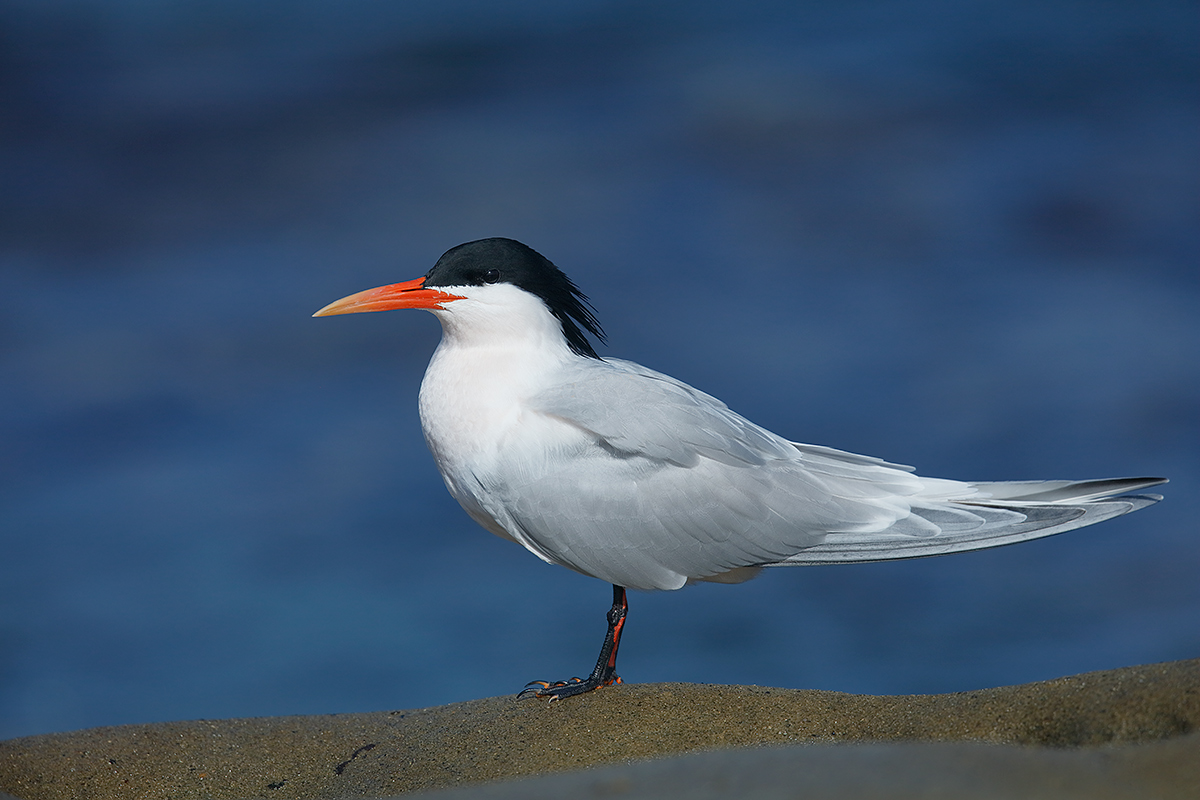
This image was created at La Jolla, CA with the Induro GIT 304L/Mongoose M3.6-mounted Canon EF 500mm f/4L IS II USM lens, the Canon Extender EF 1.4X III, and the Canon EOS 5DS R. ISO 400. Evaluative metering -2/3 stop: 1/3200 sec. at f/7.1. AWB. Upper Left Zone/AI Servo/Shutter Button AF as framed was active at the moment of exposure. The AF system selected a single point that fell on the base of the bird’s bill just forward of (and below) the eye. Click on the image to see a larger version. Elegant Tern in breeding plumage |
Elegance Personified
I photographed Elegant Tern about a zillion years ago in San Diego on film with the birds sitting on ugly black mud at the mouth of the San Diego River. When I was hanging with Bryan Holliday last week we were hoping to find a few on the low cliffs in La Jolla. The day after he headed back to Arizona, bingo: three flew in and landed right in front of me at the Green Patch! I love the blue Pacific background. I love that I perfectly paralleled the subject and I love the slight head turn toward me. And I love the perch rock.
What Don’t I Like?
There are two things about the image that I am less than thrilled about. If you think that you know what they are, please leave a comment.
A Note On Exposure
Here I went with the equivalent of my standard ISO 400 bright white in full sun exposure: 1/2500 sec. at f/8 (1/3200 at f7.1 = 1/2500 at f/8). Note that that approach worked perfectly here with Highlight Tone Priority (HTP) enabled. But as we have cautioned here often, only those who convert their RAW files in DPP should have HTP enabled. If set HTP and do not convert in DPP 4 you will have a false sense of security with your WHITEs.
Only DPP 4 recognizes the HTP settings. That means that folks converting their RAW files in ACR or Lightroom should start with 1/3200 sec. at f/8 as their standard ISO 400 bright white in full sun exposure. As in all digital exposure situations it is your responsibility to check for blinkies and to make sure that you have at least some data in the fifth histogram box… And then fine-tune the exposure if need be.
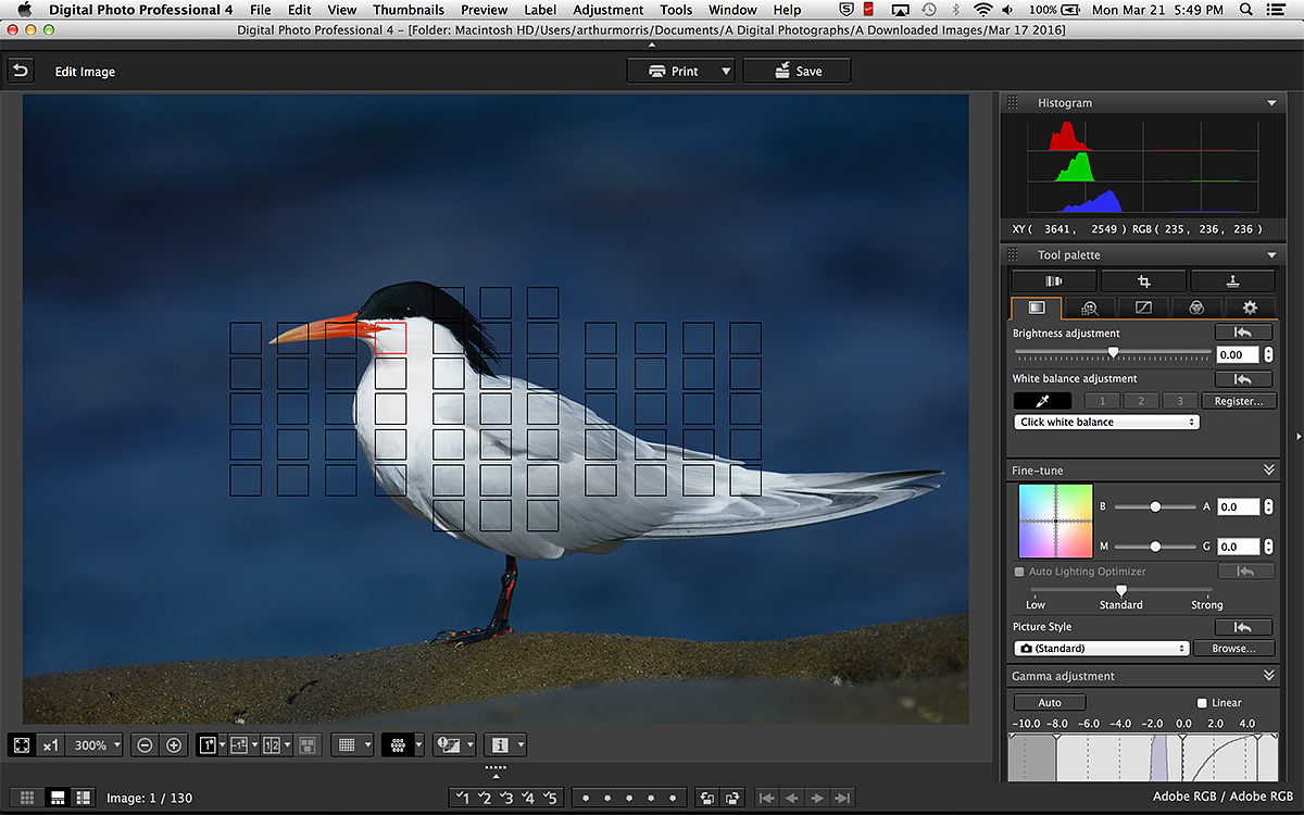
The DPP 4 Screen Capture |
The DPP 4 Screen Capture
Note that I used click White Balance on the brightest part of the neck; this yielded a nearly pure WHITE with RGB values of 235, 235, 236. As I have written here many times before I want to bring my converted RAW files into Photoshop with the RGB values no higher than the mid-230s. In this image I would not have wanted the WHITEs any brighter. As it was, I moved the Highlight slider in DPP to -2 to bring up more detail. Note that I cleaned up four tiny limpets on the rocks. I moved the Shadow slider to +3 to lighten the blue water. Noise reduction with NeatImage.
Image and Exposure Question
In the original image as seen in the DPP 4 screen capture immediately above, why was the ocean rendered as an unnaturally dark, almost blackish blue? If you do not understand exposure theory and wish to learn it you are advised to study the section on exposure theory in the original The Art of Bird Photography.
|
You can order your copy of “The Photographers’ Guide to Canon Digital Photo Professional 4.0” (aka the DPP 4 Raw Conversion eGuide) by Arash Hazeghi and Arthur Morris by clicking here. |
The DPP 4 eGuide (PDF)
The Ideal Companion to the 7D Mark II User’s Guide
Learn how and why I and many other discerning photographers choose and use only DPP 4 to convert their Canon RAW files in the DPP 4 RAW Conversion Guide by Arash Hazeghi and yours truly. The latest version supports all of the newer Canon camera bodies and several older models including the EOS-7D and the EOS-1D Mark IV.
Please Remember to use our Affiliate Links 🙂
To show your appreciation for my continuing efforts here, we ask, as always, that you get in the habit of using my B&H affiliate links on the right side of the blog for all of your photo and electronics purchases. Please check the availability of all photographic accessories in the BIRDS AS ART Online Store, especially the Mongoose M3.6 tripod heads, Gitzo tripods, Wimberley heads and plates, LensCoats and accessories, and the like. We sell only what I have used, have tested, and can depend on. We will not sell you junk. We know what you need to make creating great images easy and fun. And we are always glad to answer your gear questions via e-mail. I just learned that my account was suspended during my absence; it should be up and running by Monday at the latest.
I would of course appreciate your using our B&H affiliate links for all of your major gear, video, and electronic purchases. For the photographic stuff mentioned in the paragraph above we, meaning BAA, would of course greatly appreciate your business. Here is a huge thank you to the many who have been using our links on a regular basis and visiting the BAA Online store as well.
Be sure to like and follow BAA on Facebook by clicking on the logo link upper right. Tanks a stack!
Typos
In all blog posts and Bulletins, feel free to e-mail or to leave a comment regarding any typos or errors. Just be right 🙂


Hi Art, Hope you’re feeling better. I’m new here and I’m just learning your style from watching U-Tube videos. Also I’ve never seen an Elegant Tern. But from descriptions I have read they are described as having black legs. I would have said focal point is off the eye but that may not be a factor. Anyway it’s beautiful as all your work is, looking forward to learning more and ordering your book!
Welcome Jackie. And thanks. As I think that I mentioned somewhere in the post, their legs get red for a sort while at the height of breeding plumage. Best to get the two book combo here to maximize your learning. later and love, artie
Thank you Art! I was just looking for the link for the book. BTW love the blurrs, I’m going to have fun trying it out…Peace, Jackie
Just saw the answer on the home page. I noticed the feathers..yeah I know it’s easy to say that now that I know the answer…it helps me learn what to watch out for.
Artie – we are not at odds, I understand what you mean, thanks for elaborating
Jon
Hey Jon,
I did not think that we were at odds 🙂 YAW>
artie
Is it that the legs appear merged? Good luck!
Still no on that 🙂 a
My first and second choices have already been ruled out (foreground rock + blotchy background). The other thing I keep noticing now is that the background has the appearance of running at an 30-45 degree angle to the bird and perch. Maybe that’s the second thing you don’t like? Hope the operation went well.
That would be a no 🙂 a
Artie,
Is the lack of a glint in the black eye on the tern’s black feathers that is bothering you?
Best wishes….
Barrett
Nope 🙂
a
Clarifying things a bit:
Several folks hit on one of the two things that bother me: the bird should have been placed just a bit more forward in the frame as the tail is a bit too tight to the right frame edge.
Nobody has come close to identifying the second thing about the image that bugs me, the one that I could not control. Many are grasping for straws. Answer on Friday. a
I’ve done a tight crop of the bird just to verify to myself that I find the oof gray sandstone in the foreground a distraction. I think a bit more rolling sand coming oof into the foreground would add the right depth, but that probably wasn’t there to be had. I also find the dark patch in the top left a distraction – but others have mentioned both of these and they’re not it.
So, surely not the dozen or so pixels at the extreme bottom left that are gray? There is no oof margin so it doesn’t seem to be the same bit of sandstone. Does this mean there was an exposure improvement to be had in the sand which is generally not as sharp as the bird at the same distance, especially in the region just in front of the bird?
I am a bit confused by your comment, especially (but not only) your “exposure improvement” question. The oof bit of gray sandstone in the lower right (with some brown tones as well) is oof because it is well in front of the rock that the bird is perched on. From where I sit, the oof foreground ridge balances nicely with the dark swirl upper left. As I have stated, I like both.
You are of course free to find them distracting.
artie
I’m looking at the extreme bottom left corner. A group of pixels look like grayed-out “blinkies”. I wondered if that made you think you might have minutely improved the exposure, though I could not have.
Not grayed out blinkies; just a tiny portion of the oof ridge that runs along the lower right frame-edge. It does not bother me in the least. In fact, I did not even notice it until you mentioned it 🙂
a
Artie I read your reply but I am a little puzzled over point 3. The screen grab shows the histogram and the brightness slider has not been adjusted, it is at mid point. There are no blinkies showing for highlights or darks. I fully appreciate the darker tones will be darker when the whites were exposed “correctly” and by their nature they would inherently have more noise than lighter toned areas but you said they were underexposed by a stop. Did you mean a stop darker or they are indeed underexposed and I am missing the point, the blinkies were not switched on?
Hi Jon,
Here it is as stated and shown in a diagram in the original ABP: bright WHITEs need exactly one stop less light than middle tones to be properly exposed. In other words, if the right exposure for a bright WHITE in full sun is 1/2500 sec. at f/8 then the correct exposure for a true middle tone would be half of that, 1/1250 sec. at f/8.
It all goes back to John Shaw’s Sunny f/16 for a middle tone followed by Sunny f/22 for WHITEs.
Therefore, all middle tones are underexposed by one full stop in an image with correctly exposed bright whites, and all dark tones are 1 2/3 to 2 full stops under-exposed in an image with correctly exposed bright whites.
As the middle and dark tones are under-exposed above you need to lighten them in post and that increases the noise there.
Best advice for those who truly wish to understand exposure theory: buy the book an study the section on Exposure Theory. 🙂
a
Perhaps – if you had used the 2x instead of the 1.4x you could still have made the shot at f/8 and 1/2500 and arranged a pano stitch?
Hi Neil, Thanks for your comment. Possible, if I had photographed this species many times but otherwise no. And that is not what bothered me. artie
Not sure what is from my monitor and what is from the actual image, but I’d guess that the eye being so dark might bother you (I’d have hoped to see a bit more than the very small white speck). As for the second thing, I have no clue. Great image.
Their eyes are black! Thanks. a
black streak on the bill?
Nope 🙂 a
hi Artie,
I agree with the group: the photo is beautiful as is.
However, I’ll take a stab:
1. you said 3 birds flew in right in front of you. Did you want the other 2 birds in the photo as well?
2. seeing the black crest raised more
I love it too. Nope and nope 🙂
a
Beautiful shot, beautiful bird. A bit more space behind the tail would give it a bit more breathing room. And the background is quite dark, which is pretty and striking, and provides great contrast with most of the bird, but the black of the bird’s cap also being dark means it doesn’t stand out as much as if there’d been some lighter patch in the background just at that point. You’ve positioned the background so the cap isn’t in front of the darker patches in the background, but a slightly lighter patch there would have made it stand out even more.
Good luck on Thursday Artie.
clean lower edge (you could have controlled) and the white toe nail (no control over)
Good tried but nope and nope 🙂
a
Hi Artie,
A little more space behind the tern perhaps and the grey wedge at the bottom of frame distracts just a little.
The pacific probably needed 1/800 at f8 for correct exposure in full sun, so it’s “two stops under ” In order to keep the whites correctly exposed.
All the best for Thursday.
Doing ok here too
David
Close on the exposure but not perfect 🙂
a
Reading the comments just now…. I’m wondering if you would like a little more detail in the blacks on the head.
Strong blacks next to full white present some of the most significant exposure challenges to photographers ( particularly the wedding variety). Maybe the blacks on the head go too noisy when exposure is lifted any further.
Focus on the eye looks great to me.
D
Its awfully hard to find anything to fault here. So here goes.
I think the little bit of shadow on the front of the breast seems sub-optimal to me. If the sun was coming from a bit to the left of where it is, you might lose that shadow.
I also wish it wasn’t such a static image. Its almost like a still life. If the bird was doing something, or in more of a dynamic scene, it would be more lively.
As a portrait, though, its spectacular.
For me, portraits are where its at. And for me, the slight shadow on the front of the breast adds depth… a
I was going to say the OOF foreground rock and the aligned legs are the two minuses, but it looks like those have already been eliminated as possibilities! Given that you mentioned how you like the background, head angle, and subject angle, I confess myself stumped.
Best wishes for tomorrow!
You might wish that you had moved the bird a bit to the left in the frame. As for what you couldn’t control, you might wish the bird was doing something interesting, had something in its beak, mating, etc. Hoping for a good outcome for you tomorrow.
Many thanks! a
I’m guessing you don’t like the head angle, and the closeness of the tail feathers to the edge of the picture.
Les
Head angle could not be better… a
I love these perfect images that you ask us to find fault with! 🙂 The only thing I can see is the dark patch in the blue above and to the left of the bird’s head. Good luck tomorrow.
Thanks. I love that dark swirl of blue; it is in just the right spot! a
You beat me to it, but I’m glad to know I did have the correct answer for the exposure question. “3-And this is the most important point, the blue tones in the RAW file are pretty much one full stop underexposed because I properly exposed the WHITEs. WHITEs required one stop less light than middle tones like Pacific blue in sun. When you lighten underexposed areas of an image you are increasing the noise…”
The dark lines in the sand are actually holes in the rock and black shadows.
So far I’ve not found the 2 things you are not happy with. I would have said the oof rock and maybe the legs not defined from each other, but missed on those.
So the Canon EOS 5DS R has a small pixel sensor?
It has lots of very tiny pixels. a
The sun angle appears to have been from slightly over your right shoulder, as there are some shadows on the left side of the bird, particularly under the chin. If the sun angle was more straight on, you may not have had those shadows.
The only thing I can think of for the second item is the space between the tail and the edge of the image. You may have wanted a little more space, but it would have been difficult to move back on the cliffs.
I am fine with the sun angle 🙂 a
It is very tough to find a flaw in such a beautiful image. To take a stab at it, I would have framed the bird very slightly more to the left. The wings look a little crowded. I also would have slightly darkened the bright white feather in front of the legs on the lower breast. However, if those bothered you, you would have corrected them, so I doubt those are it.
Hi Art
I think the whites near the neck are little strong but it might be my monitor not able to render it right.
The WHITEs are just as I want them 🙂 a
Would only guess that the blue background could be a little more even or more out of focus. I would be very happy with the image as is, though. Best wishes that everything goes well tomorrow and for a rapid recovery. We will all be thinking of you.
Thanks for the good wishes for tomorrow. And I love the BKGR :). artie
The two things I don’t like:
The oof foreground.
The two legs are so perfectly aligned that they look like one leg.
Hi Ajit, Thanks for commenting. As noted below, neither of those things bother me.
artie
Artie,
Fabulous image, beautiful bird, love the slight upward slope to the rock at the back of the bird as it appears to run along the same line as the tail. The toe nail on the left side of the left foot does not have the same colors as the rest of the toe nails visible in the image.
Thanks Monte. I agree. 🙂 The red flecks on the legs and the one toe indicate that the bird is coming into full breeding plumage. I actually like the red flecks. artie
Best wishes for tomorrow Artie.
Thanks Helen. a
I would like a little more space at the tail of the bird. I love how you get yourself out everyday to take more photos.
I love that too. I have been up working on Arash’s new guide since 3am and will be heading back to La Jolla at about six :).
a
So the two things that bug me are still out there. One I could have prevented in the field, the other I had no control over. a
I must admit if it were mine I would have been pretty satisfied. I think possibly if the head were more of an angle we would have seen more of the crest on the head, the other point would possibly be the legs, if the were more apart and a foot raise something like that. There are a couple of black streaks on the sand – possibly sea weed they don’t bother me but I suspect they do you. There is an amorphous area front right, I think this is a little less than ideal.
As an aside I am amazed that you needed noise reduction on an ISO 400 image.
Hi Jon, I was and am very satisfied, but I am always in search of perfection. For me the head angle is perfect and the leg positions are just fine. And I like the black streaks on the sand as they help to balance the image and the larger one is pointing nicely at the bird. And as I said to Doug below, I love the o-o-f ridge of sandstone in the foreground.
As far as NR for an ISO 400 image, you are missing three important points:
1-the background noise looked pretty darned good.
2-small pixel camera bodies will always need more NR than large pixel cameras.
3-And this is the most important point, the blue tones in the RAW file are pretty much one full stop underexposed because I properly exposed the WHITEs. WHITEs required one stop less light than middle tones like Pacific blue in sun. When you lighten underexposed areas of an image you are increasing the noise…
artie
What you don’t like….I’ve been staring at this for at least an hour and I can’t wait for the answers. My only guess would be the oof rock in the foreground, but I’m not sure if that’s what you were talking about as far as the perch. I’ll keep looking.
Doug
I love the o-of rock in the foreground as it adds depth to the image. a