What’s Up
I have neglected to mention that both of my knees are doing great and that the scratch on my nose has healed up perfectly. I headed out early to La Jolla on Monday morning in heavy overcast with an occasional light drizzle. I concentrated mostly on some nice Double-crested Cormorants. The absence of light was a big challenge.
On Monday afternoon I began work on my 2015 income taxes.
Yikes, I almost forgot: I am feeling a bit stronger each day after the surgery and seeing several signs of improvement. Time will tell.
The Streak
Today’s blog post marks 143 days in a row with a new educational blog post. Assuming that I will be making the trip to Namibia on April 11, this streak will come to an end soon. As always–and folks have been doing a really great job recently–please remember to use our B&H links for your major gear purchases. For best results use one of our many product-specific links; after clicking on one of those you can continue shopping with all subsequent purchases invisibly tracked to BAA. Your doing so is always greatly appreciated. Please remember: web orders only. Please remember that if you are shopping for items that we carry in the BAA Online Store (as noted in red at the close of this post below) we would appreciate your business.
|
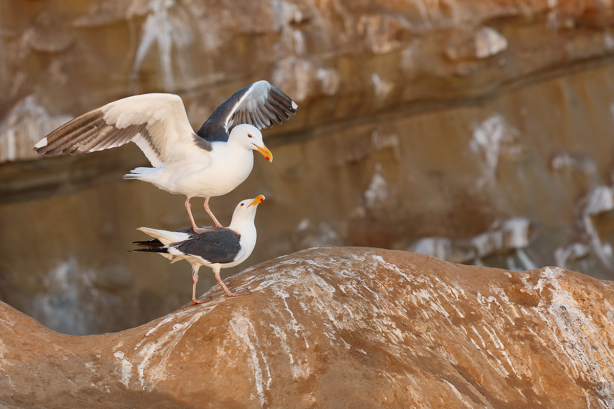
This image was created at La Jolla, CA with the hand held Canon EF 100-400mm f/4.5-5.6L IS II USM lens (at 164mm) and the amazing mega mega-pixel Canon EOS 5DS R. ISO 1250. Evaluative metering probably about zero: 1/320 sec. at f/8. Daylight WB. Two AF points to the left and two rows above the center AF point/AI Servo/Surround/Rear Focus AF as framed was active at the moment of exposure (as is always best when hand holding). Click here to see the latest version of the Rear Focus Tutorial. Click on the image to see a larger version. Western Gulls/pre-copulatory stand in early morning light |
Back in Action…
Do appreciate the double entendre… This was one of the very first images that I made after getting back in action on Sunday morning past after a 3-day vacation from bird photography.
The Look of Love
Once I saw these two Western Gulls involved with each other I moved as quickly as possible to get into position. I created only two frames before he stepped off of her. I was thrilled to see that one of the images caught her looking up lovingly at her guy. For gulls and terns the pre-copulatory stand is actually a bit of balance practice for the male; it often does not wind up with a copulation.
Whitewash
Do you hate the image because of all the whitewash? Would you have removed some or most or all of it? Why do you think that I left all the whitewash as is?
Interactivity on the Blog
Before you click out without leaving a comment please consider that the more folks who participate, the greater the learning experience for all, including me.
NeatImage Noise Reduction |
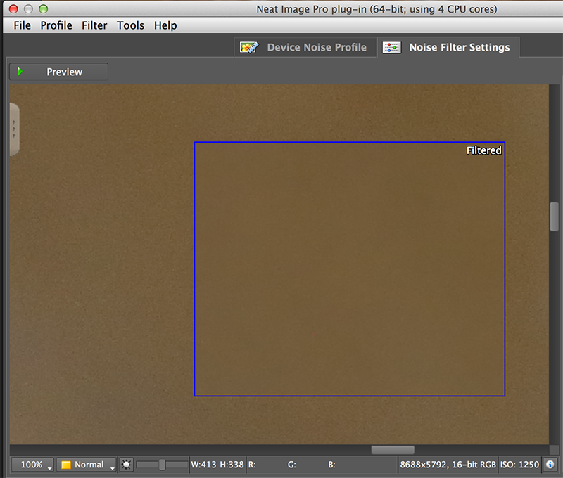
5DS R ISO 1250 and NeatImage Noise Reduction
The area in the blue square has been filtered by NeatImage Noise Reduction. The area outside of the blue box is unfiltered, exactly as it appears on the converted TIFF. While I will assume that everyone will be impressed by the virtually complete elimination of background noise by NeatImage, I need to point out the fine high ISO 5DS R control of the background noise at ISO 1250. Especially since the mid-toned sandstone is actually one stop under-exposed. Why one stop under-exposed? WHITES need one stop less light to be properly exposed than mid-tones in a given lighting condition; thus the mid-tones are one stop under what they should be, and therefore, more noisy. I am rather amazed that all of the internet experts including some very good photographers and good friends are all proclaiming that high ISO noise with the 5DS R is a problem. But heck, that’s why they are internet experts: they rarely if ever use the gear that they complain about.
The New Guide and NeatImage
The work on on Arash’s new Post Processing Guide continues to progress slowly as we attempt to iron out the kinks via e-mail and phone. The guide will teach you–as you can see in today’s featured image, to apply a small but effective amount of NR to the bird (while maintaining fine feather detail) and to apply greater amounts of NR to noisy backgrounds to smooth them out. The key to the success of these methods is a combination of Arash’s cleverly developed and innovative techniques and the great NeatImage plug-in. Arash recommends and uses only the NeatImage plug-in for advanced noise reduction. Both artie and Arash recommend only the Proversion as the Homeversion does not work on 16-bit images. Folks who are good with Layer Masking may wish to get a copy of NeatImage and get a head start on using this great program. If not, the new guide will make it simple for you. Learn more on the effectiveness of NeatImage in the blog post here.
DPP 4 Screen Capture |
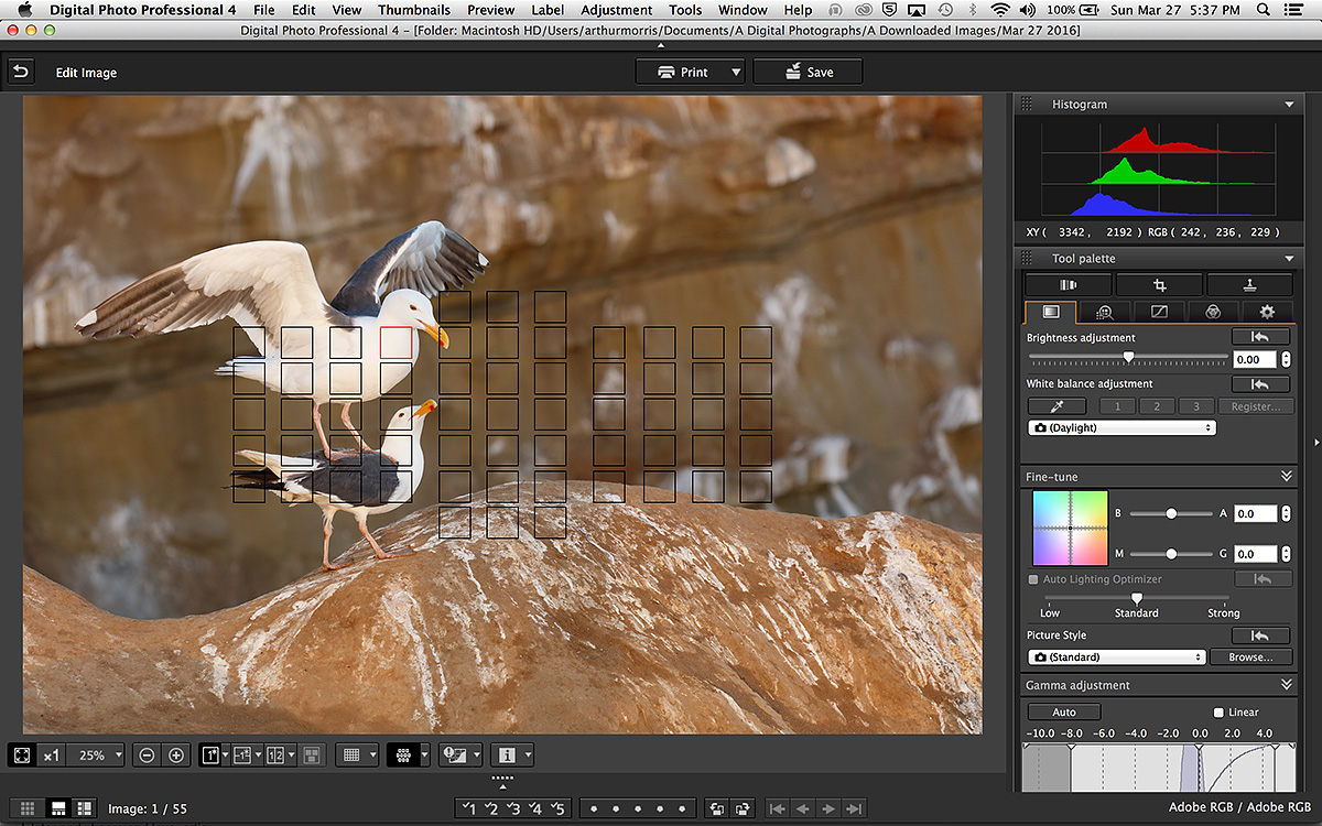
DPP 4 Screen Capture Lessons
Most importantly, note the RGB values with the (unseen in this screen capture) cursor on the brightest WHITEs on the male’s head: R=242, G=236, B=229. These values indicate a definite RED cast. I chose, however, not to color correct either by using Click WB or by adjusting the Color temperature. Why? I like the rich early morning light. In my opinion, it is not always the right move to color balance every image by coming up wWHITEs like this: R=235, G=235, B=235. Had I done so with this image it would have lost a lot of its glamor for me.
The illuminated in red AF point indicates that that point was both the selected AF point and that it was active at the moment of exposure. The more you practice moving the AF points and the closer you get the selected AF point to the bird’s eye, face, bill, or neck, the more accurately focused your images will be.
Note also that as I preach here on an almost daily basis that the there is data well into the fifth, rightmost, highlight box of the histogram. The red channel extending past the other two also indicates the RED cast.
Please Remember to use our Affiliate Links 🙂
To show your appreciation for my continuing efforts here, we ask, as always, that you get in the habit of using my B&H affiliate links on the right side of the blog for all of your photo and electronics purchases. Please check the availability of all photographic accessories in the BIRDS AS ART Online Store, especially the Mongoose M3.6 tripod heads, Gitzo tripods, Wimberley heads and plates, LensCoats and accessories, and the like. We sell only what I have used, have tested, and can depend on. We will not sell you junk. We know what you need to make creating great images easy and fun. And we are always glad to answer your gear questions via e-mail. I just learned that my account was suspended during my absence; it should be up and running by Monday at the latest.
I would of course appreciate your using our B&H affiliate links for all of your major gear, video, and electronic purchases. For the photographic stuff mentioned in the paragraph above we, meaning BAA, would of course greatly appreciate your business. Here is a huge thank you to the many who have been using our links on a regular basis and visiting the BAA Online store as well.
Be sure to like and follow BAA on Facebook by clicking on the logo link upper right. Tanks a stack!
Typos
In all blog posts and Bulletins, feel free to e-mail or to leave a comment regarding any typos or errors. Just be right 🙂


Hi Artie,
I love your site and your exhibition in SD. Great images!
My comments refer to your first image above, which I really like. It is so hard to make an image that is different, and this one works very well. I really like the feather detail over the head of the bird. I’m not sure how they got there, but that’s part of the appeal of the image.
It’s also a good image to discuss the rules of photography. A couple of “rules” in play here:
1. Thou shalt always focus on a bird’s eye
2. Thou shalt never center an image
Personally, I wouldn’t worry about focusing on the eye in this image, since it’s almost invisible. I would focus on the feathers.
I find it disturbing that the Rule of Thirds so dominates photography that one doesn’t dare to take a shot like this with the bird centered. I know, I know, but there I’ve said it. I saw an exhibition some years back in the same place where your exhibit is/was. It was a head/shoulders portrait with a black background and horizontal format. The person’s image was at the far right and half the canvas was empty black. Is this what we’ve come to? I’m not saying that I would necessarily prefer the heron centered, as I like your composition too. I just think it should be a matter of personal taste, but it is not.
Great image. I like how the foreground whitewash helps define the shape of the …foreground. It really makes the subtle curve of the rock pop out from the background.
Re: the background whitewash – couldn’t you mask and select for the background and merely pull the whites down a taste? I agree, no matter how subtle, I rarely like it when I know someone has used something like a gaussian blur to soften the background/mimic OOF objects.
The whitewash tells me a lot about a place I don’t know. Seabirds galore!
Question? Is the DPP software the same software that came or that comes with canon cameras? I’m not on my main PC at the moment…but I will look when I am. I like the break down on the histogram. Right now I’m using LR 5.7… Also I like Elinor Osborn explanation of the whitewash…so happy I found BAA…now if only I could get my birds to do something… 🙂
I bet you are out shooting is sunny CA!!
Peace,
Jackie
Yes, DPP 4 comes with the cameras. I never use LR :). If you look into DPP 4, we have a guide for that too and it is best to download the latest version, DPP 4.4 I believe. a
ps: was out photographing this morning…
Artie, The first thing that popped in my head was. WOW, he actually left the whitewash!! I think you left it because it helps tell the story. “Here you have a couple that finally got a private moment together…after the party so to speak.” I don’t find the background distracting…the large white splats look like birds that have flown into the cliffs…like the marks that are left on my windows when a bird try’s to fly through it…
Your post are helping me understand the histogram and the importance of getting data in the far right box. Looking forward to getting better photos on my end. 🙂
Keep healing!
Jackie
I’d leave the whitewash. To me, it shows the gulls are at home there. And besides that it flows in artistic lines, mostly pointing to the two gulls.
Hi Artie i am just asking if you / Arash use Neat Image on top of DPP NR ??
Or is NR set to 0 in DPP ??
As in his/ your old DPP guide you used DPP NR .
Maybe i am wrong .
BTW hope you will recover from your issues and can make it to Namibia .
Where are you going to ?
Cheers Andreas
Hi Andreas, We both set NR in DPP 4 as per the newer guide. And then do NI on top of that to clean things up as you see in the images.
Looking good for Namibia right now many thanks. Going to the usual great places. Stay tuned 🙂
later and love, artie
Hi, Artie. I would have left all the whitewash. It says things about the place the birds are. I like the image. The male appears much larger than the female; is that real or just an illusion? Glad you’re doing better.
Thanks. In Western Gull the males are larger. a
Hi Artie,
If it were mine, I would have preferred to have the background more out of focus (or diffuse) in that I find it somewhat distraction. I am sure there are other techniques, but you could mask out the foreground and loving pair and go thru a noise reduction step and/or add some blur. I would not remove the white wash (either foreground or background). I think it helps the overall texture of the scene.
From my perspective that would isolate the subject of the photo; the interaction of the pair.
Frank
Thanks Frank. Proper use of the subjunctive “if it were mine…” 🙂
I find that when I try to mess with backgrounds like this my efforts are mega-obvious…
a
I really love the foreground whitewash. Gives a sense of place and all the lines sort of converge at the birds, drawing the eye to them.
The background whitewash (and background in general) is, to me, distracting and not helpful. If it was more out of focus and softer, perhaps it would be less so. Perhaps if you were lower, more at the birds level (not sure if possible there), the background could be sky and the foreground whitewash could be preserved.
Artie, great to hear you’re making such progress with post-surgery, knees, etc. Attitude is everything!
Good double entendre!
The bright white feathers on the gulls is what my eye is drawn to. The background and foreground are simply the reality of the situation. I really like that the female is looking back and up at the male!
The whitewash on the foreground cliff is fine to me, as it flows in complement to the lines of the cliff. But I would prefer a more softened background. I especially don’t care for the white blob above the male.
I had two thoughts about the whitewash. One was “yuck” the other was kinda liking the color symmetry of the whitewash and the gulls. My eye is drawn to the big blob on the right foreground so I would probably tone that down to make it less abstrusive.
Thanks for commenting Jim. Toning down the big ones would work for me.
You chose the wrong word 🙂
abstrusive: difficult to understand; obscure: an abstruse philosophical inquiry.
I am sure that you meant this:
obtrusive: noticeable or prominent in an unwelcome or intrusive way.
I had to look them up to make sure that I was right.
Have a good one, artie
Yup, that’s what I meant. My intentions were good but my spelling checker was off.
BTW, I’m ordering a new laptop today and will use your B&H link. Be well. jim
🙂 Many thanks for the laptop order. What are you getting? Good luck with it. Do send me your B&H receipt via e-mail.
later and love, artie
ps: just two commonly confused words so spell checker would not have helped 🙂
I getting the top Macbook Pro. I do some video so when I buy, I tend to get all the horsepower available. I’ll forward the receipt. jim
Great and thanks times 2! I love my Macbook Pro; wish I had switched a few decades sooner 🙂 a
I would leave it as is.
It would probably be a different story if you cropped in closer, then the whitewash would over power the color of the rock. Leaving the crop where it is, I think it blends in nicely. As far as removing, etc….hard to explain without actually drawing on it, but I’d clone out the white parts where they’re more like blobs vs lines, which is only a few spots.
Doug