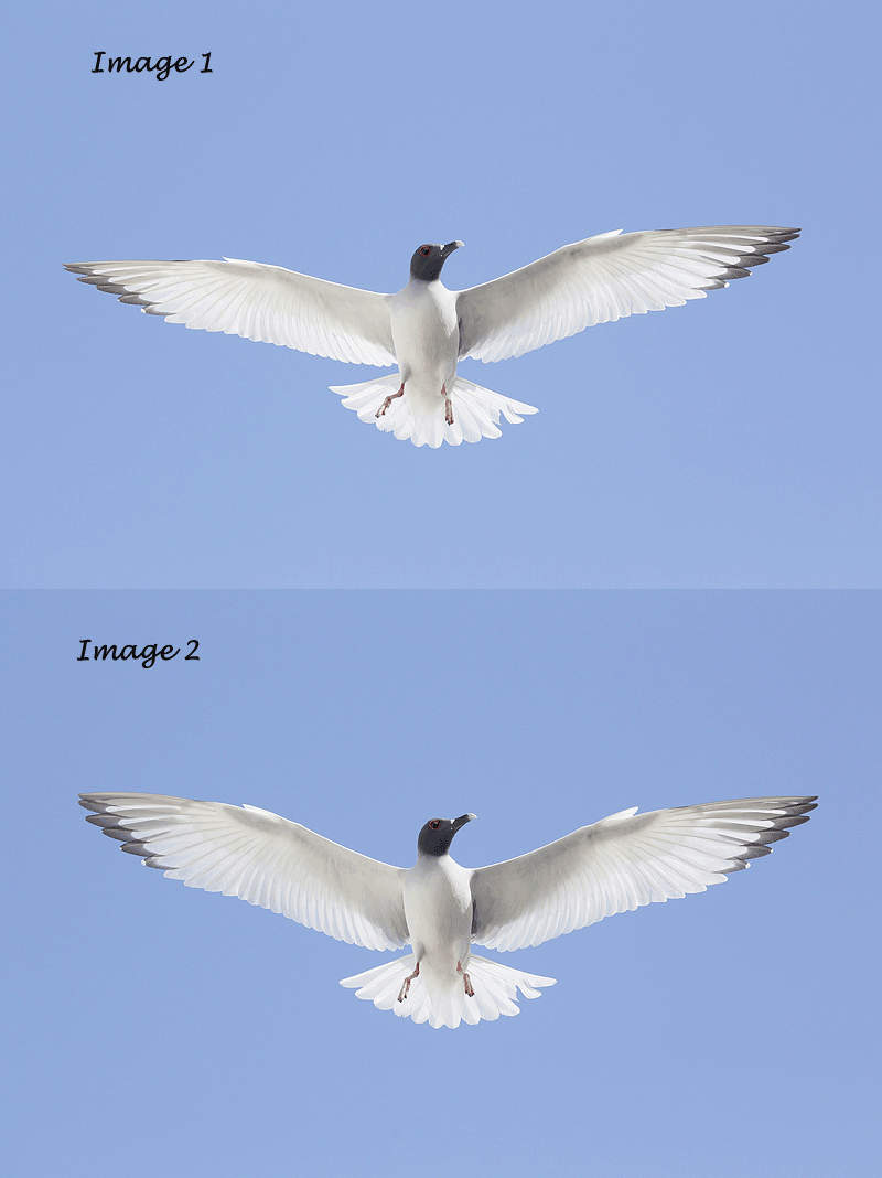
These images were created at Darwin Bay, Tower Island with the Canon 70-200mm f/2.8L IS II lens, the Canon EF 1.4X III TC (hand held at 140mm), and the Canon EOS-1D Mark IV. ISO 400. Evaluative metering +1 2/3 stops: 1/3200 sec. at f/4 in Av mode. |
Swallow-tailed Gull
On the recently concluded Galapagos trip we had some great flight photography chances at Darwin Bay whenever a cloud came by. Which of these images is best, Image 1 or Image 2? Be sure to let us know why. And be specific.
I will be off-line (on the bear boat) until 8-11-11 and will share my thoughts with you when I return.
Shopper’s Guide
Below is a list of the gear that I used to make the images above. Thanks a stack to all who have used the Shopper’s Guide links to purchase their gear as a thank you for all the free information that we bring you on the Blog and in the Bulletins. Before you purchase anything be sure to check out the advice in our Shopper’s Guide.
Support both the Bulletins and the Blog by making all your B & H purchases here.
Canon 70-200mm f/2.8L IS II lens. Man, I am loving this lens on my shoulder with the 2X III teleconverter. I also use it a lot with the 1.4X III TC which is designed to work best with the new Series II super-telephoto lenses.
Canon EOS-1D Mark IV professional digital camera body. My two Mark IVs are my workhorse digital camera bodies.
And from the BAA On-line Store:
Double Bubble Level. You will find one in my camera’s hot shoe whenever I am not using flash.
Be sure to check out our camera body User’s Guides here.
The Lens Align Mark II. I use the Lens Align Mark II pretty much religiously to micro-adjust all of my gear an average of once a month and always before a major trip. Enjoy our free comprehensive tutorial here.
Delkin 32gb e-Film Pro Compact Flash Card. These high capacity cards are fast and dependable. Clicking on the link below will bring you to the Delkin web site. There is lots of great stuff there. If you see a product that we do not carry let us know via e-mail; we will be glad to have it drop-shipped to you and save you a few bucks in the process.
I pack my 800 and tons of other gear in my ThinkTank Airport SecurityTM V2.0 rolling bag for all of my air travel and recommend the slightly smaller Airport InternationalTM V2.0 for most folks. These high capacity bags are well constructed and protect my gear when I have to gate check it on short-hops and puddle jumpers. Each will protect your gear just as well. By clicking on either link or the logo below, you will receive a free gift with each order over $50.










Both are good but I prefer 2, however I would prefer on both less space below.
Milan, Please remember that the images presented are from the extracted JPEGs and thus represent the full frame original capture. Needed crops will be executed during the image optimization process. artie
Like (most?) everyone else I like #2 but it seems like I should like #1. The pose in 2 is just a little too perfect. Should a gull really take on the classic eagle pose? Seems like the gull is an impostor. I also like the eye in #1, I connect with the bird in this one. In #2 it just looks past me and seems cold and aloof. Alas, symmetry wins out but I hope I’m wrong.
Doug, I work very hard to make perfect images and rarely succeed (though I am close here…) To my eye, #2 is far superior to #1. And I see no difference in head angle or eye contact. If you have a problem with perfect images–which, BTW, are very, very rare–I would suggest counseling of some sort 🙂 artie
Artie, definitely the second one. I dont think feet are that big a deal but the right wing and HA are better in the 2nd image. I guess this is the advantage of high fps in the camera.
I’d go with Image #2. The glint in the eye draws the attention a little better, the head has a better angle and the wing tips are better displayed. There’s more symmetry as well, but that wouldn’t be the top deciding factor for me.
The bird has a little dent in one of the tail’s feathers. I guess some people would clone that out; I wouldn’t.
Cheers.
I prefer Image 2. In Image 1 the gull’s right wing is dropped down a bit, the right leg is angled outward, and the wing feathers are closed in somewhat, giving the gull the appearance of being somewhat twisted in relation to the lens. In Image 2 the right wing is held up higher and the right foot in in toward the median line of the gull, giving the gull a more symmetrical appearance. The feathers are more extended making the wings appear fuller and also giving better definition with the translucent light passing through the feathers. The gull appears to be more front facing toward the lens. I note also that the length of the wing spread on-screen in both images is the same.
The second image, is better, both from the symmetry point of view and as the bird’s right wing has opened a little more we get the lovely definition and contrast in the feathers. Was that also due to your adjustments?
But I really like seeing the alternating images. It gives a hint of how birds fine tune their wings every split second to deal with that lumpy old air they have to fly in.
Pete
Second one – specifically because of the wing and leg symmetry.
I agree with Robert in particular and all the others, in preferring image 2. More length to the head and it appears sharper to me.
No 2, I think you may have done a little selective colour of perhaps a linear curve to enhance the black plumage a little. There appears to be a minor difference in bird position/size making the bird more impactive.
I guess I prefer image 2. It’s more symmetrical.
I prefer the wing-spread and angle of the bird in image 2.
I think the wing is broader in #2 . . . the angle of #1 makes it slimmer. I prefer the broader view because it adds drama/beauty.
I like #2 better because it has a better eye and feathers seem to be in sharper focus to me.
I prefer Image 2 also.
My thoughts are the same as Elinor
I like image 2 because the feathers are more spread open and the bird is more symmetrical (especially the feet). Important to be symmetrical since the bird is placed in the middle of the composition.
Hi , All the photographers should give the details as you have given.
I agree. It makes it easier to learn. artie
2 is better. Tighter is more compelling, wings horizontally aligned, legs vertically ditto, wings and beak more crispy.