
Congrats to Eric A. Rosen. His Great Horned Owl on curved branch was awarded third place in the Captive category of the BIRDS AS ART 1st International Bird Photography Competition. |
Last Two Captive Lessons
Lesson 1
I followed my own suggestion on the Great Horned Owl on curved branch image above. I selected the bird using the Quick Selection Tool, put the selection on its own layer( Control J), and then lifted the Curve (Control M for Curves on a Layer) to taste. All as described in Digital Basics (that includes my complete digital workflow as well as dozens of great Photoshop tips).
|
Congratulations to Stan Hoyt. His image of a Toco Toucan (St. Augustine Alligator Farm) is the frst-prize winner in the Captive category of the BIRDS AS ART 1st International Bird Photography Competition. |
Lesson 2?
Above is Stan’s Captive category winning image as presented to the judges. Starting with his RAW file, I created the similar but different optimized version below. Please let me know which you like best, the original image above or the re-crafted image below. And be sure to let us know what you like or dislike about each version.
|
This is my version of Stan’s category-winning image. |
B&H Double Rebates Include the 5D Mark III
Click here. Select one of four current Canon camera bodies–both the EOS-5D Mark III and the EOS-7D are in the group. Add a lens–there are 30 in the group, a Series III teleconverter, or a Speedlite, and enjoy large double rebates. The lenses include lots of my favorites: the 70-200mm f/4 L IS, the 70-200mm f/2.8L IS II, the circle lens, the 180 macro, and the 300mm f/4L IS. You can check the specs on all Canon telephoto lenses here. This double rebate offer expires on April 2, 2012.
Nikon Dslr + Lens Bundle Rebates
Click here for details. Offer includes the brand new D3200 and the D7000.

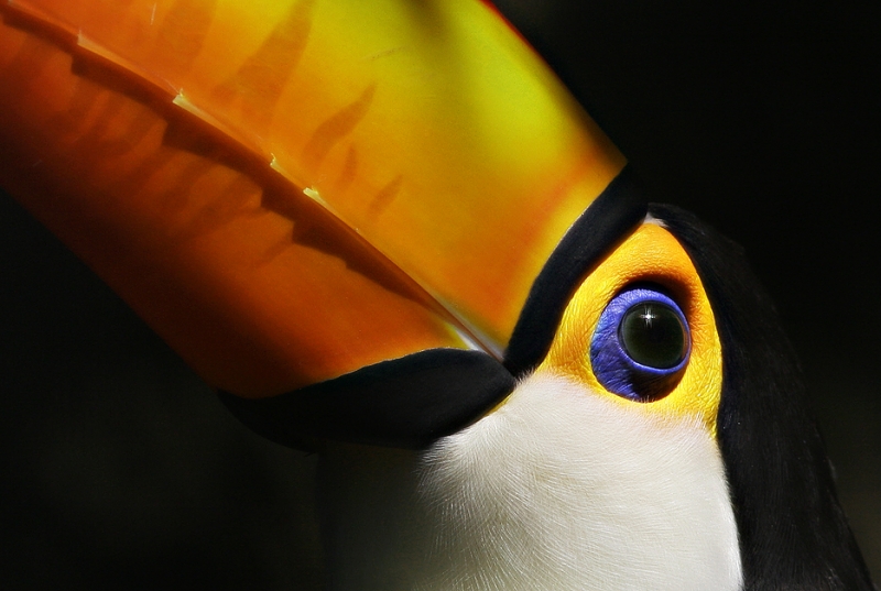
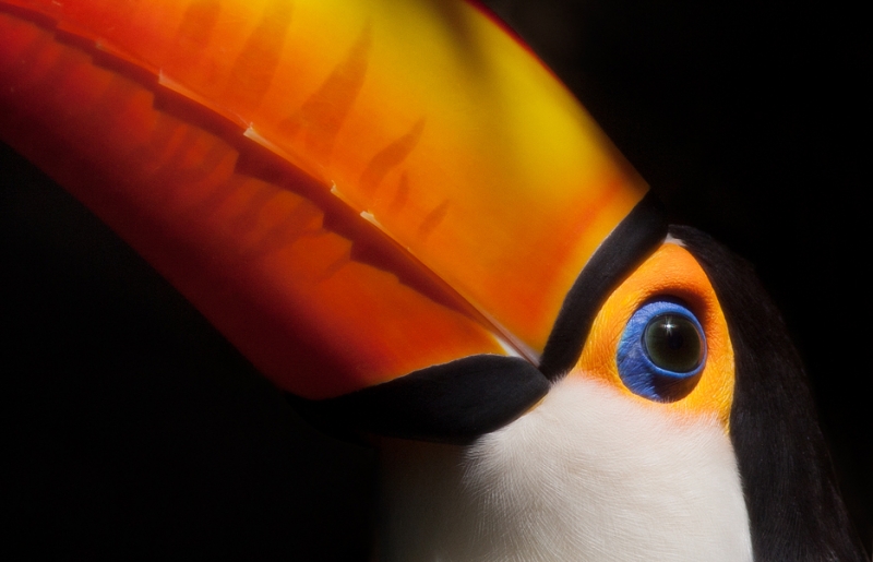










I prefer the original in both cases. In the owl shot, the reworked image looks too bright on the owl, like it was slightly overexposed by a flash. In the second image, the original retains more detail around the eye and the white of the neck.
I see improvement in the owl picture although I placed it last in my voting. The coloration of the background looks too much like a backdrop instead of a natural scene for me. But lightening the owl does help a lot. With the toucan, I like the softer colors of the original better, but the different cropping improved it as did the sharper edge of the upper bill.
Hi Artie,
I see what you did to the Owl and it does look a lot lighter. I think it comes down to personal tastes. I was not sure about going that much lighter on the image so I stopped the adjustment where I had left it. I thought it looked too light to me, but it does look like ther is more pop to the bird. I guess I have to learn a bit more about processing images.
The GH Owl adjustment seems to make perfect sense to me. It’s almost a if a fill in flash has miraculously appeared. I understand the wider crop for the Toucan, it changes the balance nicely, and I accept the minor clean up on the bill and the darkening at lower right. But what you did with the main features of the subject has failed, for me. The way the Toucan image works for me is that although you realize the reality of what you see the colours clamour for your attention so powerfully, and then you’re drawn back to the reality of the subject by the wonlderfully sharp detail in the skin feathers.
I’m right and you’re wrong. Hah! :p
Arthur, I love what you did to the Owl. That little adjustment in curves added a nice separation between the bark of the tree and the bird.
I like the color version on Stan Hoyt’s image because I felt that the alternate version was too warm for me, maybe its my monitor. As far as composition, I prefer Artie’s version. There is a nice tension between the weight of the beak and the head/eye position in the field.
It is incredible what we can appreciate when viewing images in RGB. I hope Nature Photographer magazine can capture Toucan colors in CMYK. I would love to have this image printed with hybrid inks on a 40″ x 30″ uncoated cover sheet with cyan, magenta, and yellow touch plates.
Art;
Thanks, for all you do sharing you knowledge with the photographic community. Looking at the two pictures. I like the improvements you did but in doing so there seems to be some loss of detail in your picture of the the feathers or is it just my old Eyes.
Joe Moran
Joe, You are most welcome. I agree with you on the loss of detail in the WHITE feathers.
Artie, I think that your eagerness to help others improve their photography is contagious and I hope it continues forever. You are amazing.
Many thanks Lady D. See you in San Diego tomorrow!
I like the Toucan touch-up except for changing the tone of the yellow in the bill. Fantastic on the Owl, it needed more contrast from the branch. Great work on both images. What is the next category ? The suspence is agonizing.
I’m not wild about the owl, seems too harsh, maybe somewhere between the two examples might be more my taste. And the toucan crop is better but again not crazy about the other improvements. That said I’m so glad that you put these out there. They help me a lot in seeing what you mean and also adding to my vocabulary and skills when working with my own images.
The color change (yellow to orange) and the small detail changes do improve the photo in a technical sense. One hesitation in my comment concerns what is the color of the real bird….are we making a fake bird? Should small imperfections on the bird stay on the bird? Please take this as a philosophical question, not a criticism of your fantastic skills.
One other nagging problem…I judge photos for my local camera club and in my list of judging requirements (focus, composition, clean-up) is a question:
Would I take this photograph home and hang it on my wall?
If the answer is no, I assign zero points. Some folks call this a GUT feeling score. Is this a fair question? For this reason my order of the finalist’s is different than the majority of voters.
What a thrill it would be to own one of these photographs. That brings up a question…..was the judging all done with electronic images? Did anyone look at a paper photograph? Is this a major change in photo contests?
Egad..somebody shut me up!
If a contest permits image clean-up it makes sense to me to present a more beautiful image…. I give good scores to lots of images that I would not hang on my wall…. All judging here and in all major international contests is done with electronic images.
I like the increased saturation/ luminosity of the second toucan image. It adds depth to the image but the eye now looks a bit cloudy which is an unacceptable trade off for me.
I see more colour in the Toucan original, a cooler green, rather than the hotter tones of Artie’s version
Amano
Sorry for replying last night with the first thing that came to mind. Please understand that I am not against learning how to use tools better, including post processing, either from Art or more experienced photographers on this site. It just felt like a slight to do it the two prize winning photos, but hey that’s just me. One thing that bothers me is taking a jpeg image back into PS to mess with it when the Original Raw would have so much more depth. As for my mis-spelling of “peeves”. I always have trouble with that word. Guess I better learn how to spell it since I seem to have so many of them. Peace to all.
No problema. I did start with the RAW file :).
I like Stan’s Version better, the bright colors really make the image stunning. Artie, I do love the fact that you included more of the bill, It adds a bit more to the toucans overall character. Some of the minute cleanup you did really makes this a flawless shot.
The edited image of the owl helps it to stand out a bit more. The overall brightness also helps to direct the viewers eyes to the owl as there is so much going on otherwise.
This is fantastic Artie, so much learned and so much more to learn. Thanks!
One more thing I noticed – the blog makes Artie’s version of the Toucan look soft. If you click on the image to get the full size version it looks a whole lot better.
thanks Charles, yes the smaller pic doesn’t do Arties editing any justice for the Toucan, but now looking at the larger image I can see where he was coming from now.
Thanks both especially Charles. Going from 1400 to 800 is too much compression for the 800 size.
I think the extra detail in the owl offered by the modified lighting is better. I do feel though that the image although pleasant, does look rather contrived. Perhaps if the background was rendered a little more out of focus it may improve credibility.
I like both versions of the toucan, they both have their place, I like the detail in the original but I have to confess the soft treatment in the modified version is growing on me more and more.
Click on version II of the toucan so see it sharper. 🙂
I love the intensity of the mix and range of Stan’s colors…
For me, the striking yellow hues were terrific… Vidid, real ….captivating!
The sameness of color in the reworked photo took away from the vitality of the image.
I loved the little owl from the get go… and yes, I liked the lighter image better… but it was his character that won my heart.
Thanks Deirdre. I am not sure if the changed colors were a color mis-management issue… But I do agree.
I like the sharp detail of the eye, skin around the eye, and white feathers on the neck of the Stan Hoyt version of the Toucan. Congrats Stan, a fine photo.
Me too in part.
The owl is definitely improved, but for me the toucan original is better, it just looks more realistic colours and more detailed texture that I prefer. The edited version is starting to look a little more like a stuffed toy. This is in no way a criticism of the skills and efforts to improve on the image, but I feel in this case that the original is so good that I don’t think It can be improved on!
Agree with much of what you said but the original crop IMHO is too tight. And the photographer agrees. 🙂
Art, I hope you had the permission of the two photographer’s before you tried to “improve” their images in Photoshop. I know it would diminish my joy at having my image selected for an award, to have the sponsor try and improve the original in Photoshop. It implies that the original photographer didn’t know how to best handle his post processing. As you can tell this is one of my pet peaves. By the way I honestly liked the originals better!
Hi Colin, You must be new here! I think you will find that most of the people who have joined the broader BPN network, of which I see this as being a part, benefit from the comments and critiques that are freely given – that is why they join. Often comments are accompanied by a repost – sometimes better, sometimes not. It is a great way to improve your photography and PP skills, so most people are pleased rather than peeved. Looking forward to seeing some of your images on BPN!
Colin, Diminished joy is a choice; Byron Katie; http://www.TheWork.com. One of the main points here is that many contest winning images could have been be improved within the rules. The fact is that most folks don’t know how best to handle the processing of their images. Did you see the Philippine Eagle before and after? The photographer was thrilled with the after. Some folks choose to learn and grow rather than to have their joy diminished. My goal here is to get the best files to Nature Photographer magazine for publication. One of my pet peeves is folks who cannot spell peeves correctly :).
I’m just not in love with the owl on the limb. I thought it looked too contrived/edited to be an original, if that makes sense. It looked like it had too much fill light and recovery plus too much saturation when opened in Camera Raw. There was too much sharpening on the body and limb and not enough contrast on the the background and sky. However, your lightening the body did look better. On the toucan I liked your bill above the black line especially the lower edge of the bill illuminated just a little more. Below that black line I like Stan’s feather detail better and the purple around the eye better. The toucan is just killer and I liked it the best of all 10.
Me too on the toucan. But I loved the owl on the branch from the get-go. Different strokes.
On second thought I like the original toucan coloration of bill as well so the only part of the second version that improved the look was illuminating the lower edge of bill and perhaps the crop…just my thought. (I do find that differences in monitors from my desktop 24″ to my Razr Maxx make some opinions kinda relative, don’t you know. Do Color Monkeys work on smart phones??)
I like your crop better as well, especially the proportions of the bill to the white throat, and also the improved placement of the eye. The main reason I cropped where I did was to minimize the (in my opinion) distracting shadow on the bill at the top. I am sure there are ways to handle that in Photoshop but my skills are not up to it yet. I do appreciate all your helpful (and gentle) comments. Very educational!
Stan, Can you re-do your image from scratch utilizing your processing and my crop? I will e-mail you with upload instructions. As I said below, my goal is to get the best possible file to Helen at Nature Photographer magazine for publication–the eleven winning images will be published in the Summer issue.
I’ll do my best. Let me know where to upload.
Thanks. We did the same with the winner of the Hand of Man category and the result of the collaboration was outstanding! If you converted in ACR your conversion setting will be remembered. I will e-mail you now.
I was unfamiliar with the “Quick Selection Tool” so I scanned my March 2011 version of Digital Basics and found no reference to that tool. Please clarify where that tool is located in PS.
Ah, the brain fools us at times. The Quick Selection Tool lies in the Tool Palette along with the Magic Wand Tool. Denise Ippolito taught me to use it when working with decent amounts of contrast. It is pretty much intuitive–work the tool along the edges and you will figure it out very quickly.
Prefer your crop, but his detail!
Me too in part, and his color especially.
Sorry, Artie, but I prefer Stan Hoyt’s version, primarily because of the fine detail around the eye and the white area just below it. That said, I do like the detail you pulled out in the bird’s head (right side of image) and the enhanced detail on the beak in your version. So I guess maybe it’s a tie 🙂
No need to be sorry. I asked because I was less than happy with my version. 🙂
While I like the improvements you made to the owl image, I have to admit that I still prefer Stan’s version of the Toucan. Your version has a warmer, softer, more subdued mood which I can certainly appreciate but it doesn’t have the same impact for me when placed side by side. I like the bright and agressive tones of the contest winning image.
So do I, but my wider crop is much stronger as is the BKGR :). I have had all kinds of color management issues when working with the contest JPEGs…
Ahhh you are totally right about the crop. I did not notice on my iPad screen. Much better.